
MenTools came with a clear challenge, and no rulebook. Brought in as the sole in-house designer across three brands simultaneously, the role demanded complete creative ownership from day one. No handoffs, no second opinions, no existing design system to fall back on.
Everything visual, from the foundational brand identity through to daily social content, product launches, app assets, video production and printed materials, was conceived, built and delivered by one person. The role became as much about building a scalable creative infrastructure as it was about producing individual assets.
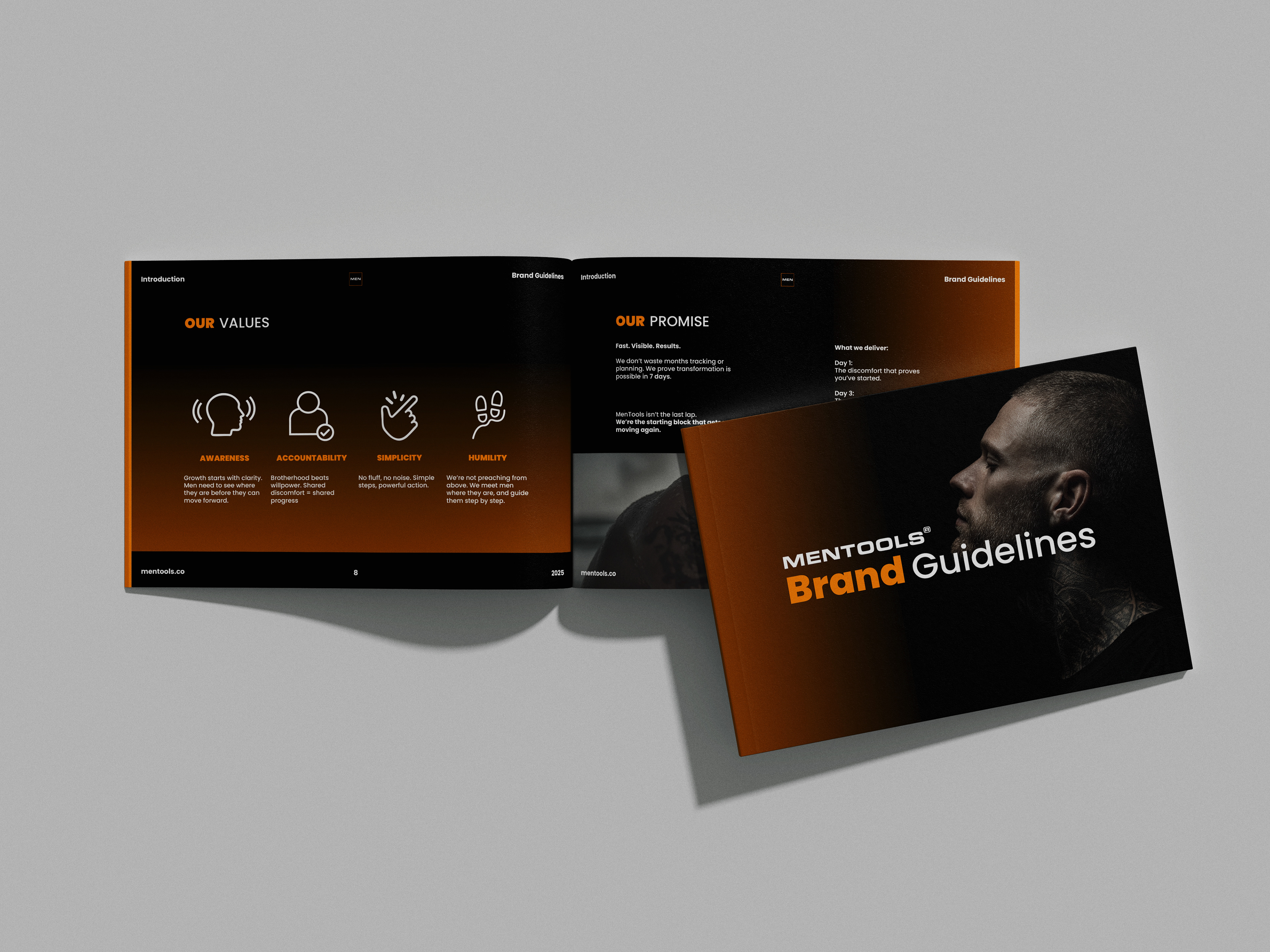
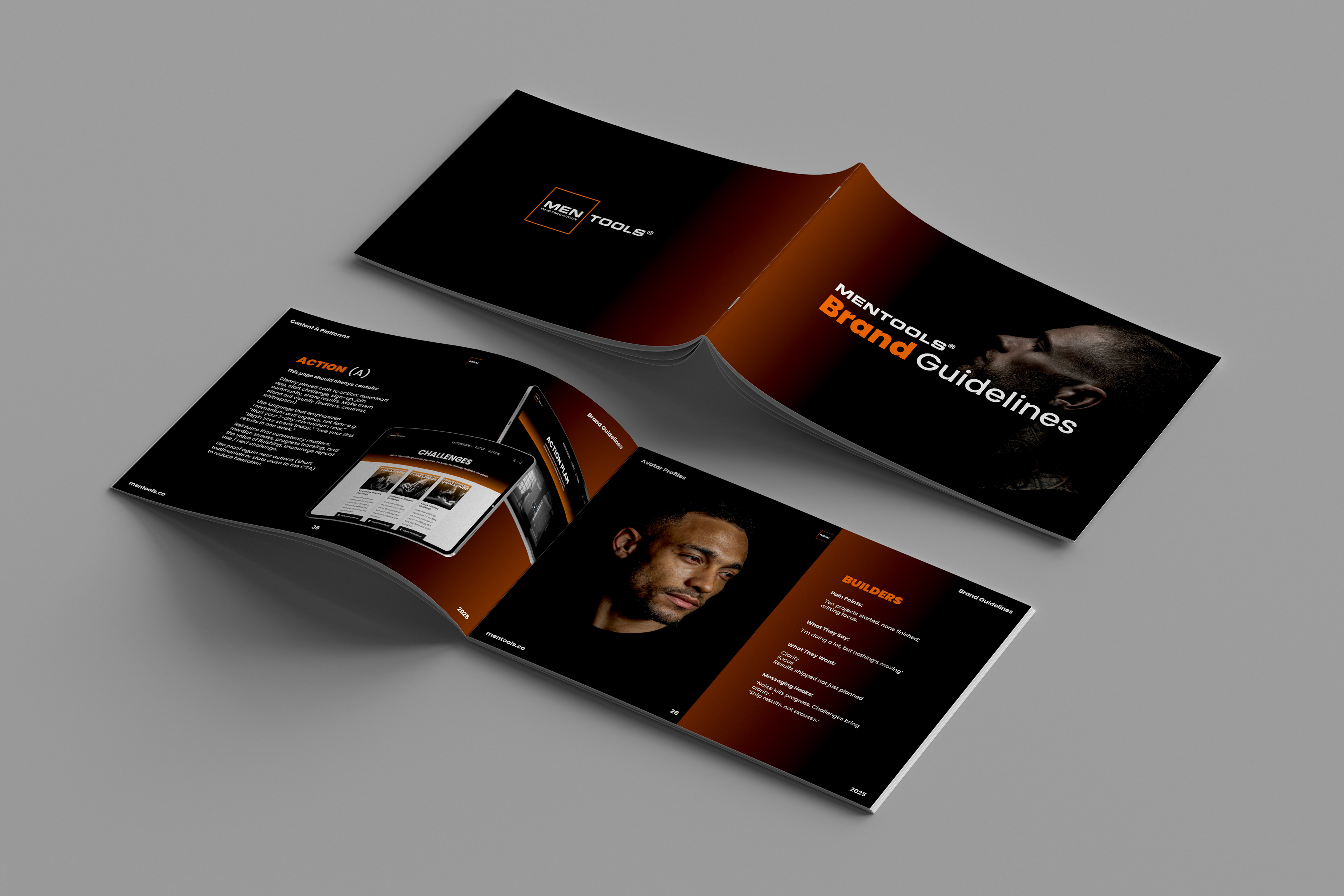
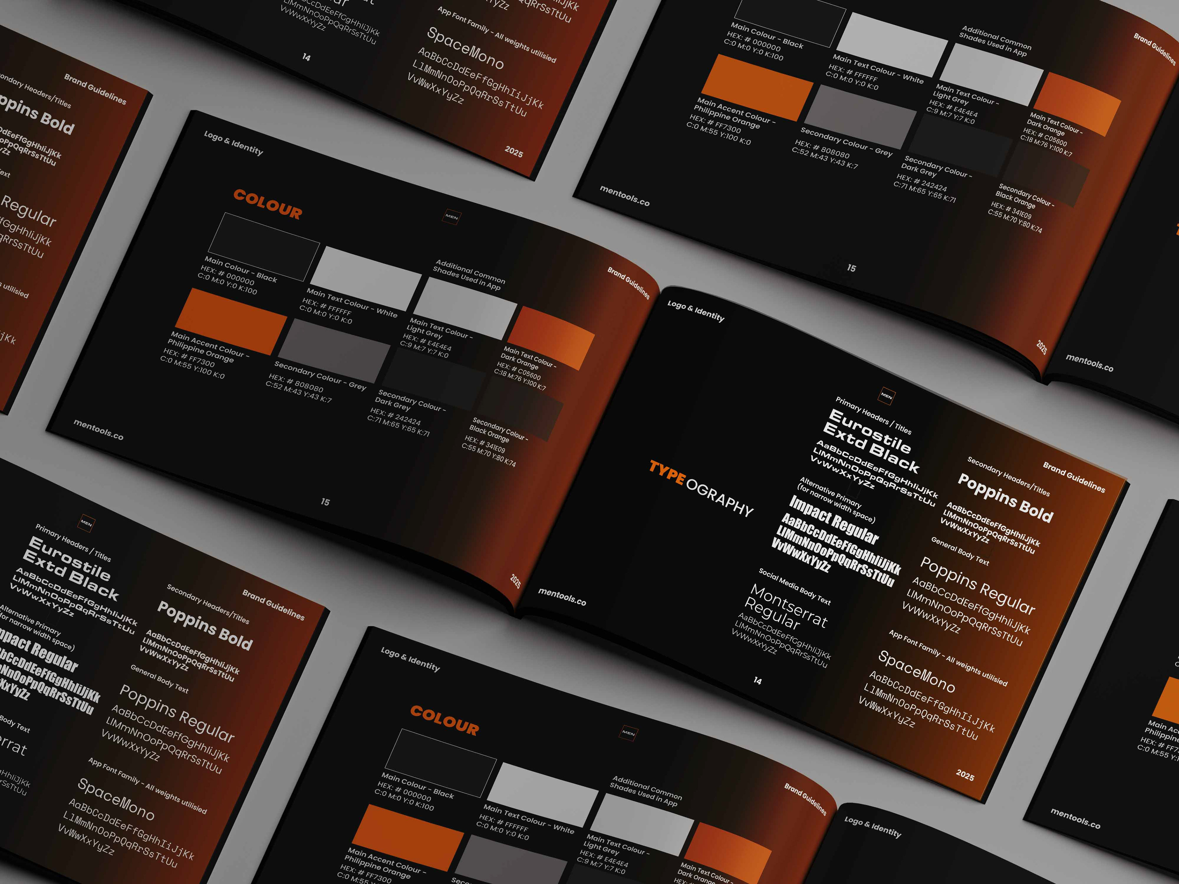
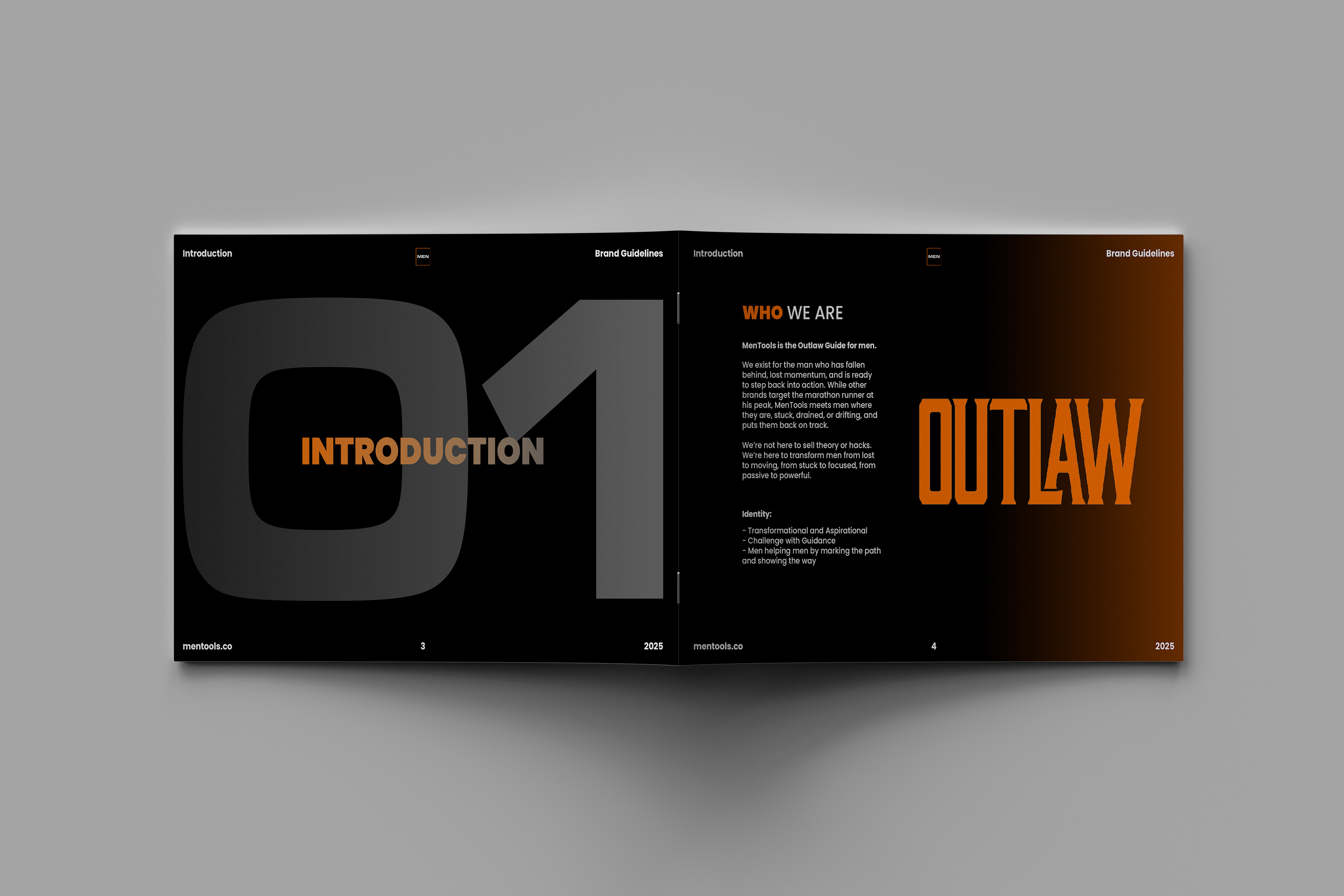
Brand Guidelines & Visual Identity
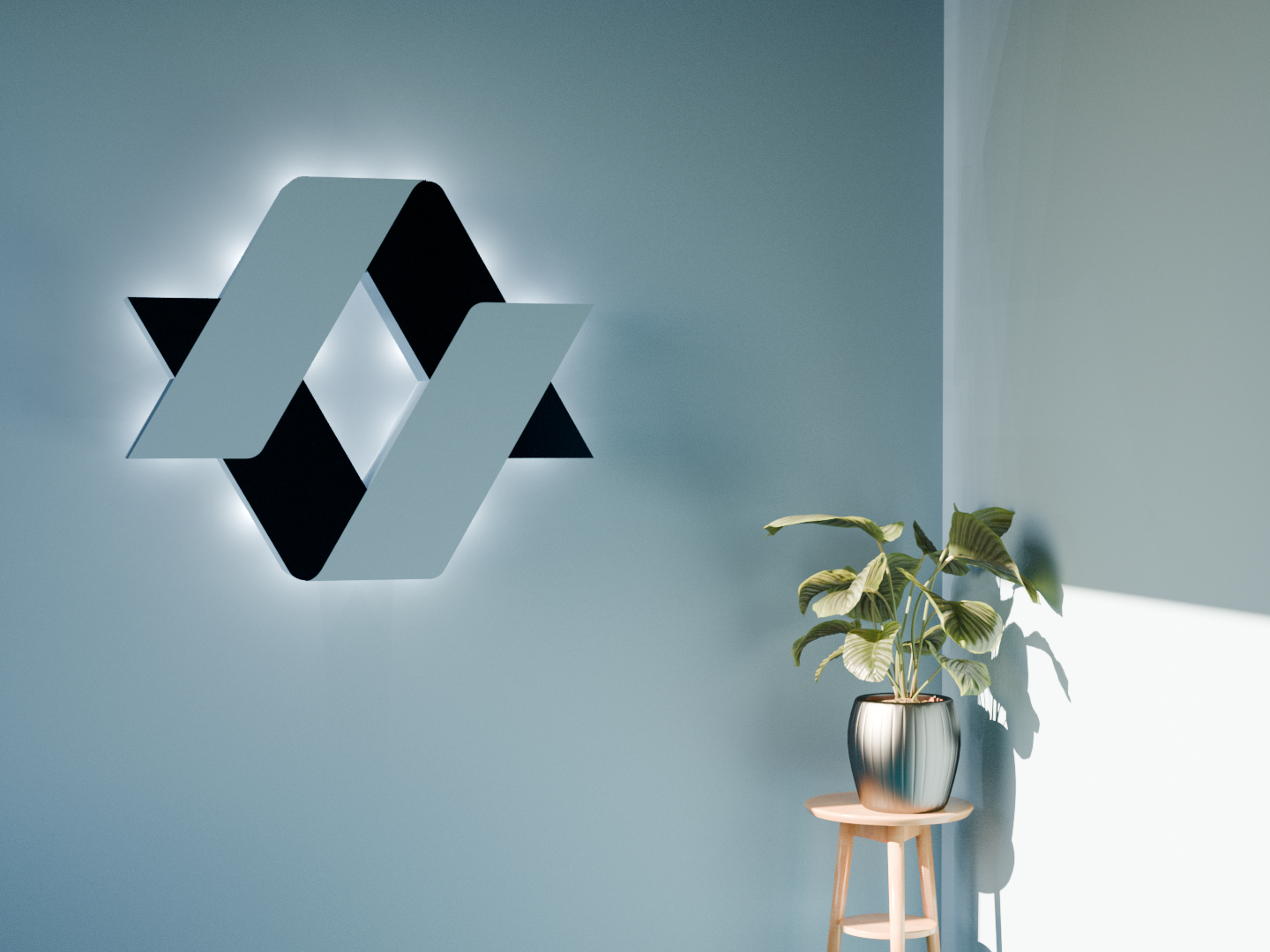
Before a single asset could be created, MenTools needed a visual language to build on. As the sole designer, defining that language was the first and most foundational task, establishing the rules that every subsequent piece of work would follow.
The brand guidelines were built from the ground up, covering every touchpoint a growing brand would encounter, colour system, typography hierarchy, logo usage and spacing rules, iconography, and tone of voice. The goal was to create a document thorough enough that any designer, developer or external partner could pick it up and produce work that felt unmistakably MenTools.
A brand guidelines document is rarely seen by an end user, but it's felt in everything they do see. Getting this right first meant that every asset produced after it had a consistent, confident foundation to stand on.
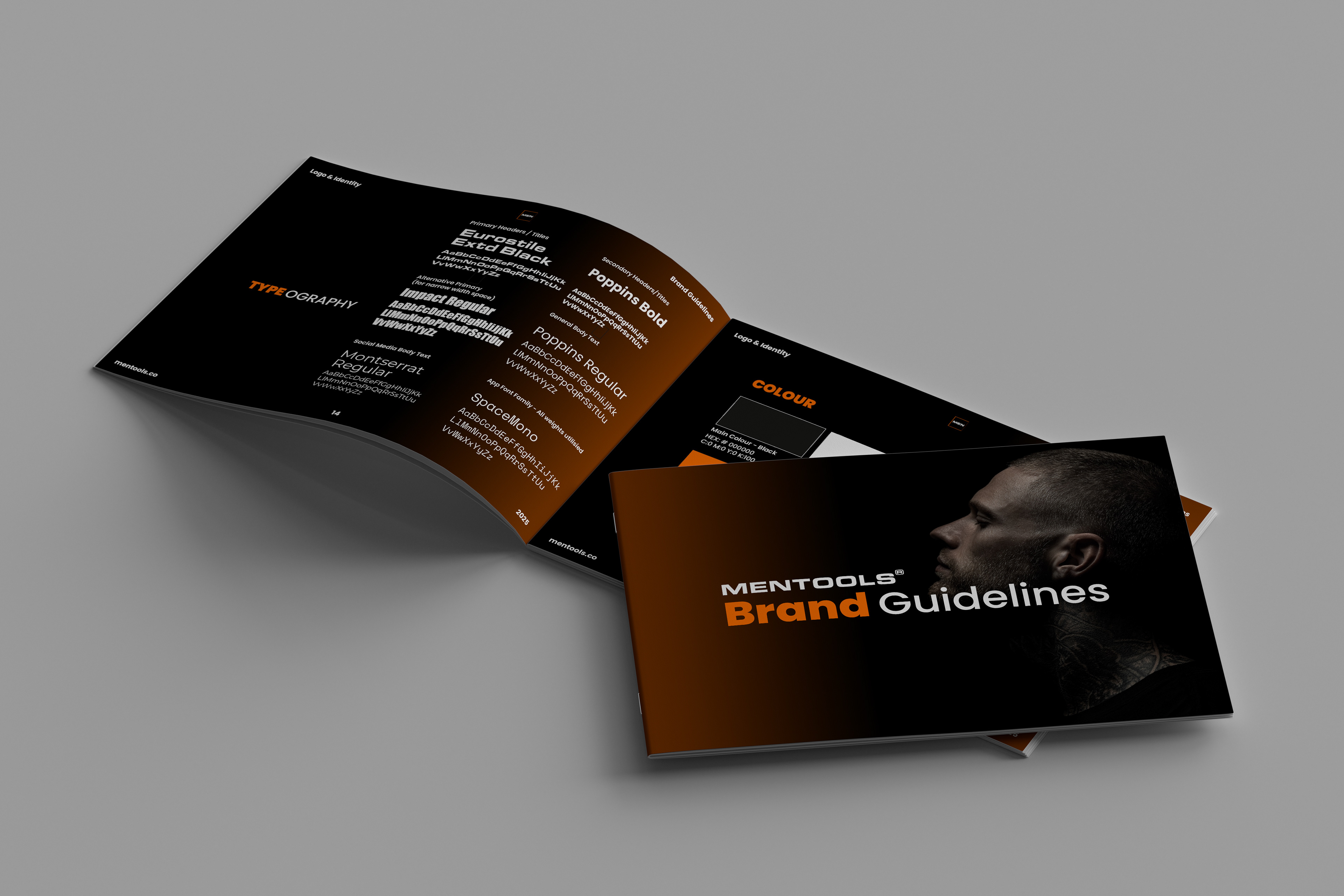
Every asset that followed was built on this.
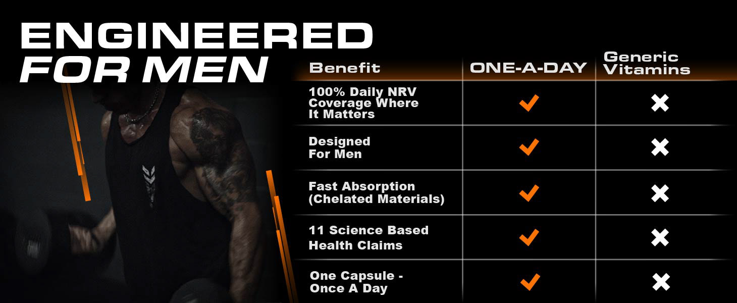
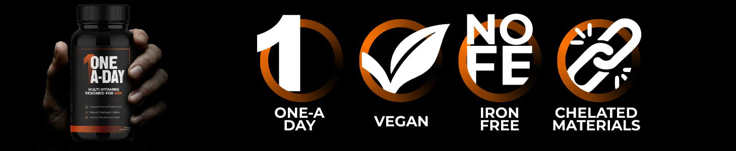
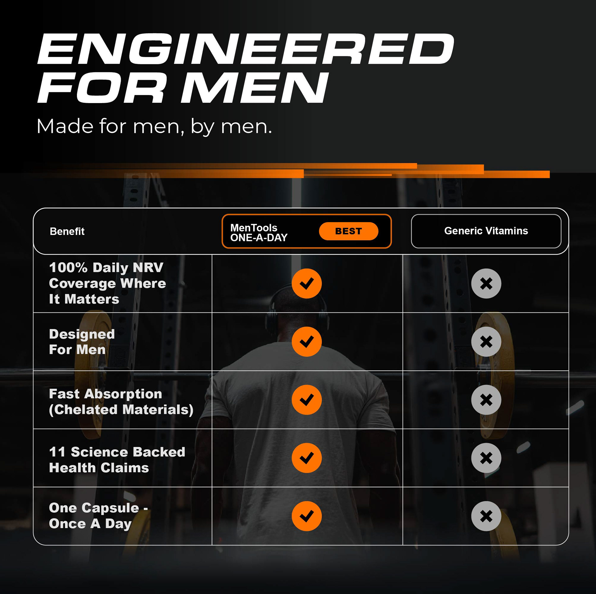
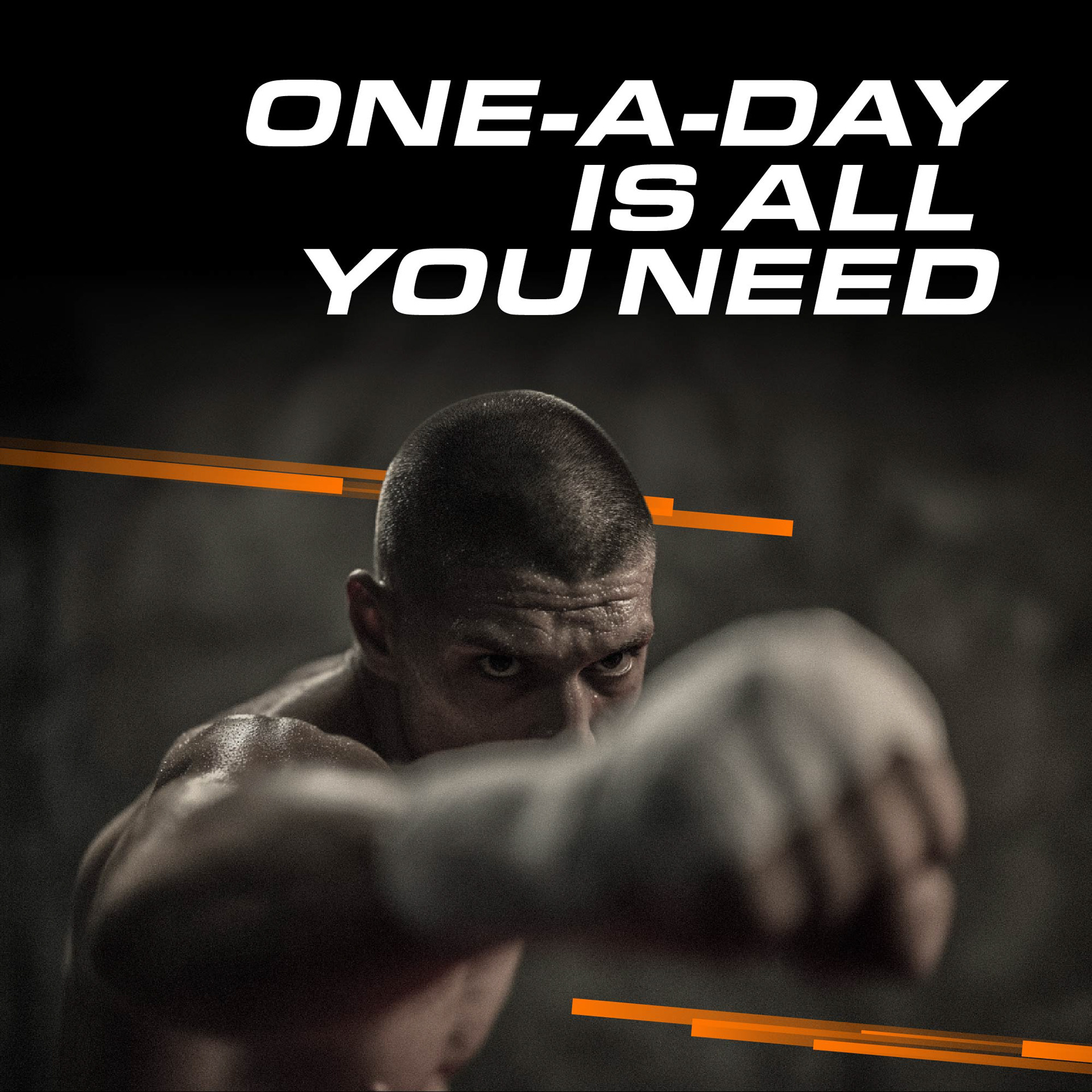
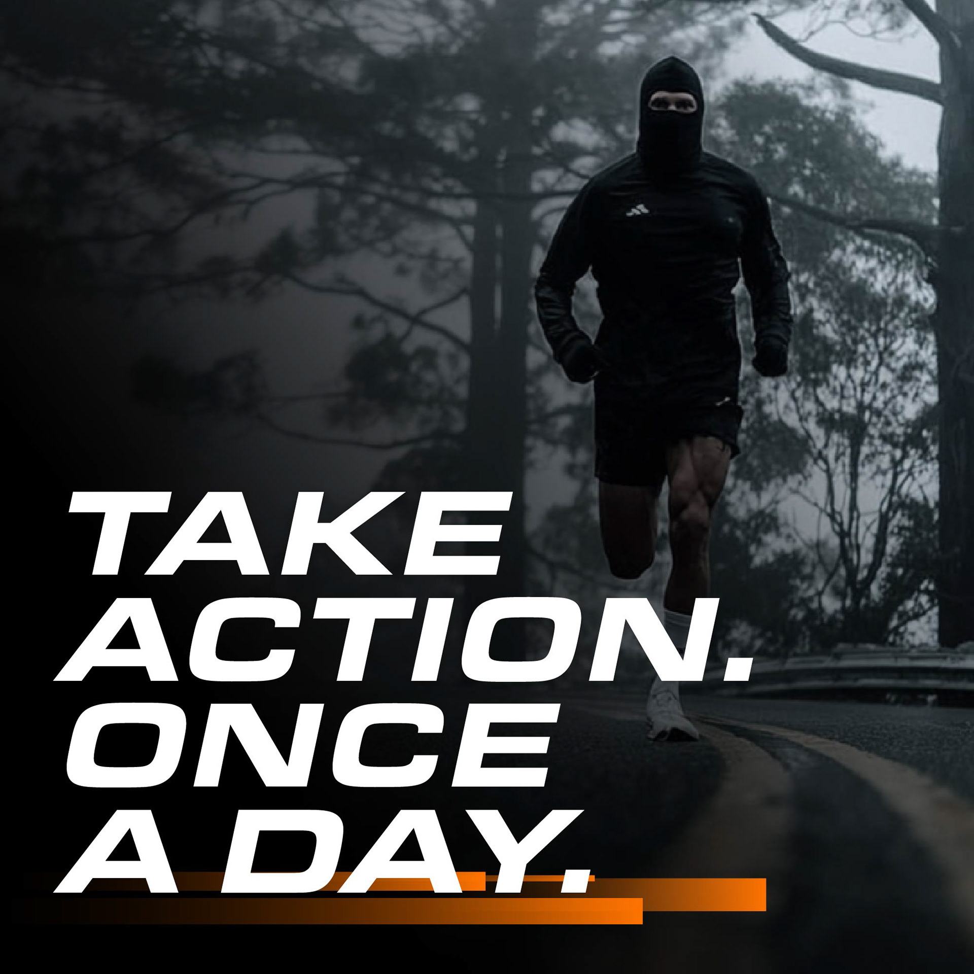
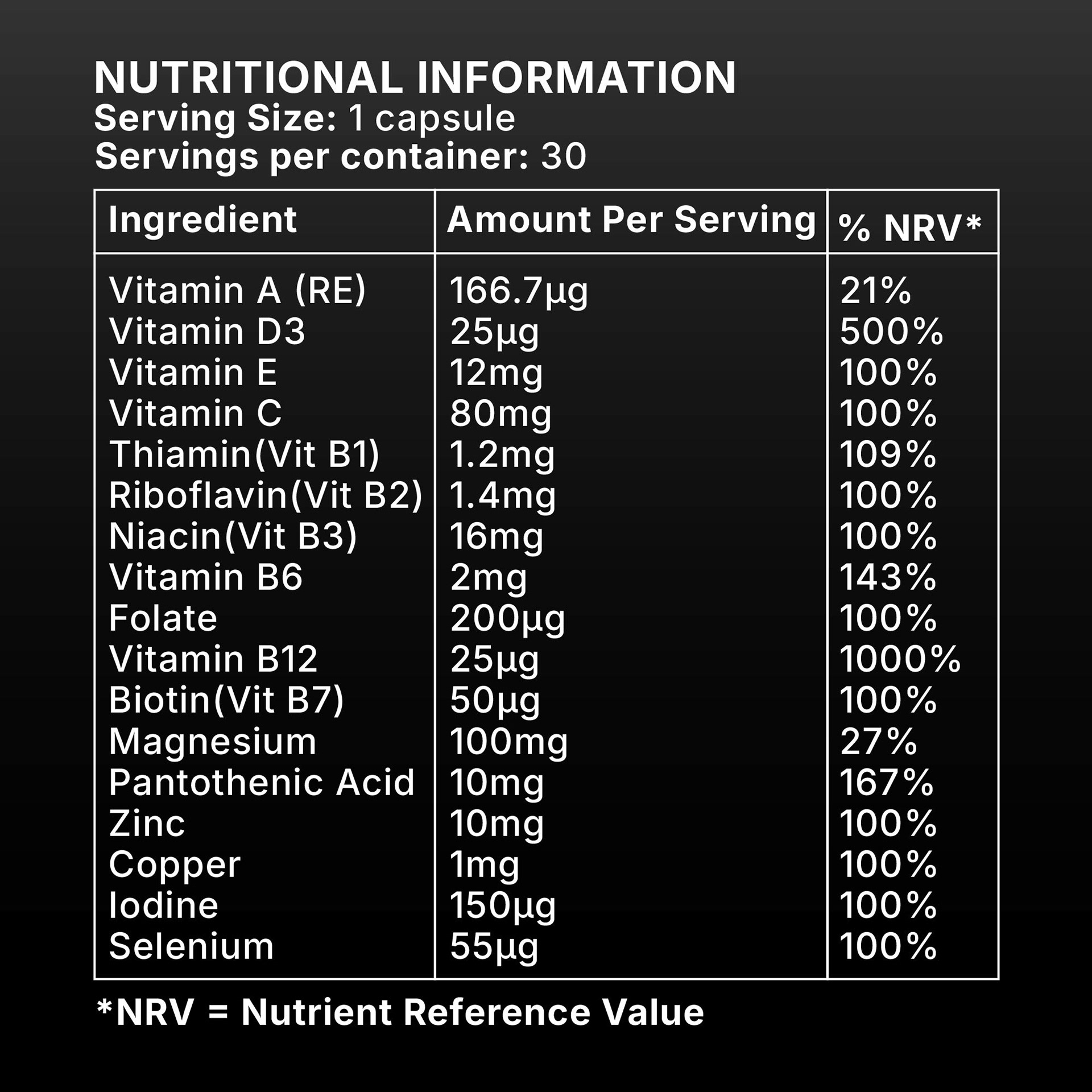
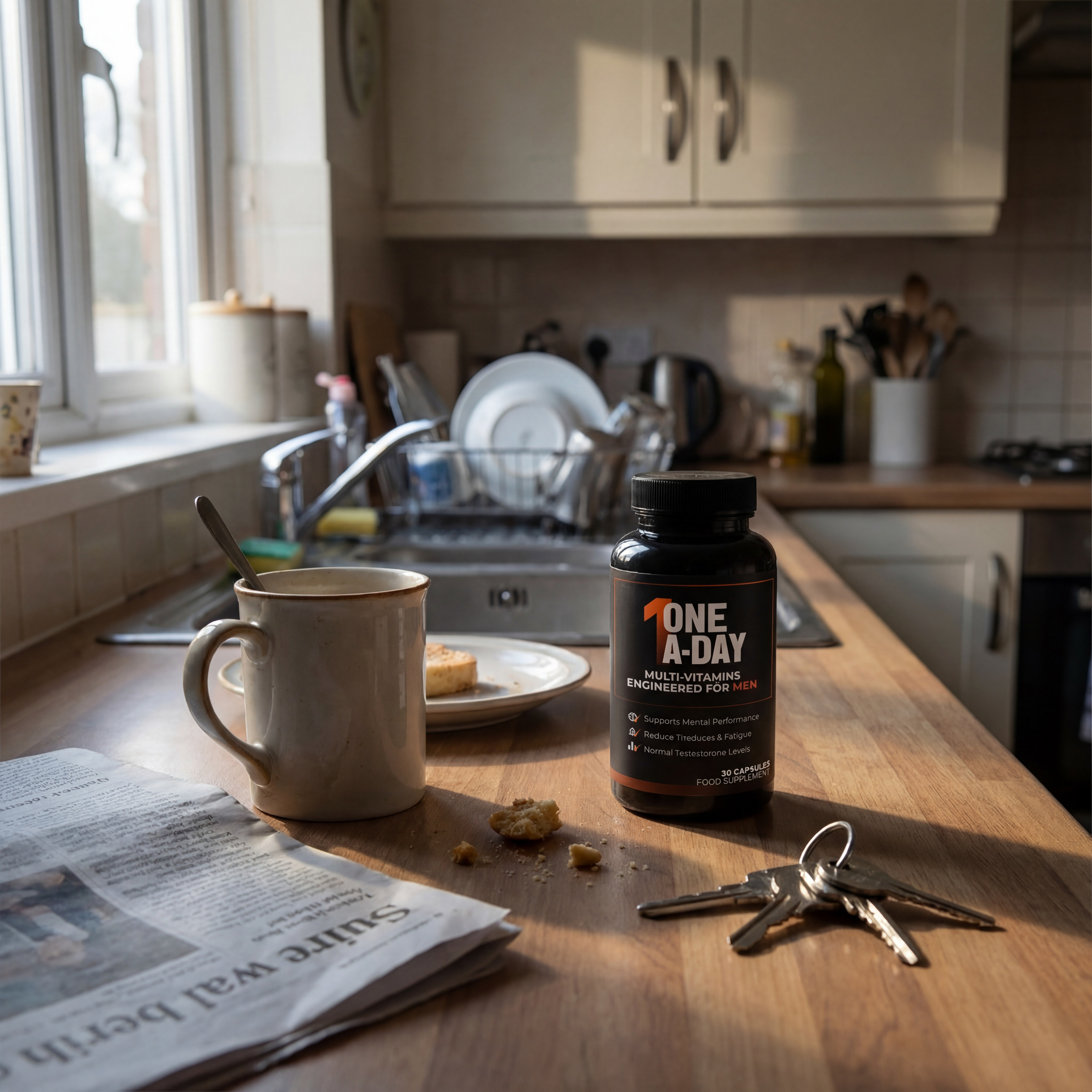
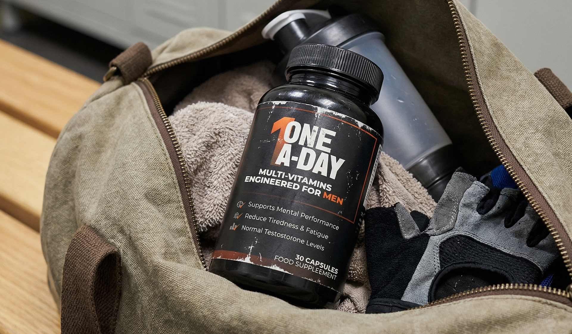
Amazon Product Launch (ONE-A-DAY Multivitamins)
Launching a product on Amazon is a design challenge that operates on multiple levels at once. The imagery has to stop a scroll, the A+ content has to convert a click, and every asset in between has to maintain the same brand voice across completely different formats and contexts.
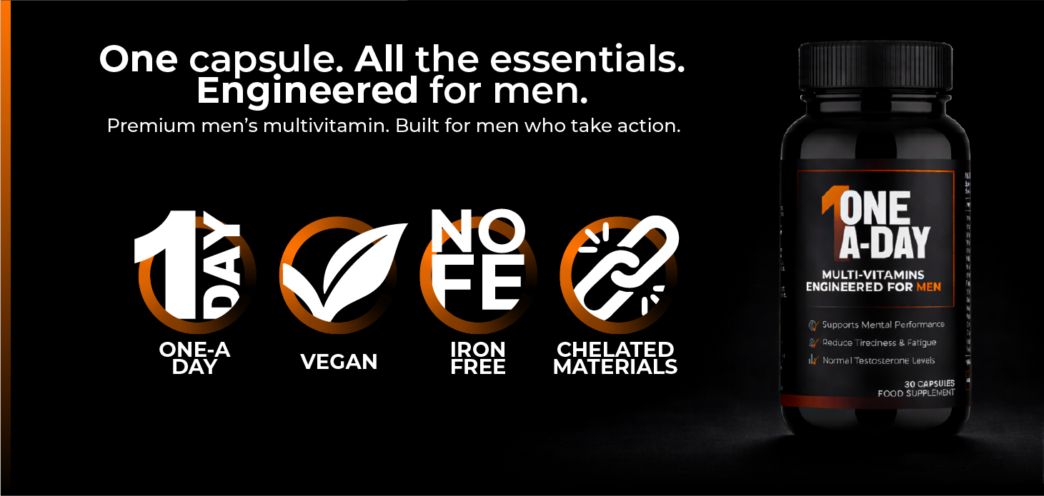
The MenTools multivitamin launch was handled entirely in-house, meaning every visual element from product photography and lifestyle imagery through to A+ content modules, static ad creative and launch video was conceived and produced by one person, without an external agency or production team.
The A+ content required particular precision. Amazon's format is rigid by design, modular, structured, heavily templated, and the challenge was creating layouts that felt distinctly MenTools within those constraints. Every module had to earn its place, balancing visual impact with the kind of clear, benefit-led communication that drives conversion.

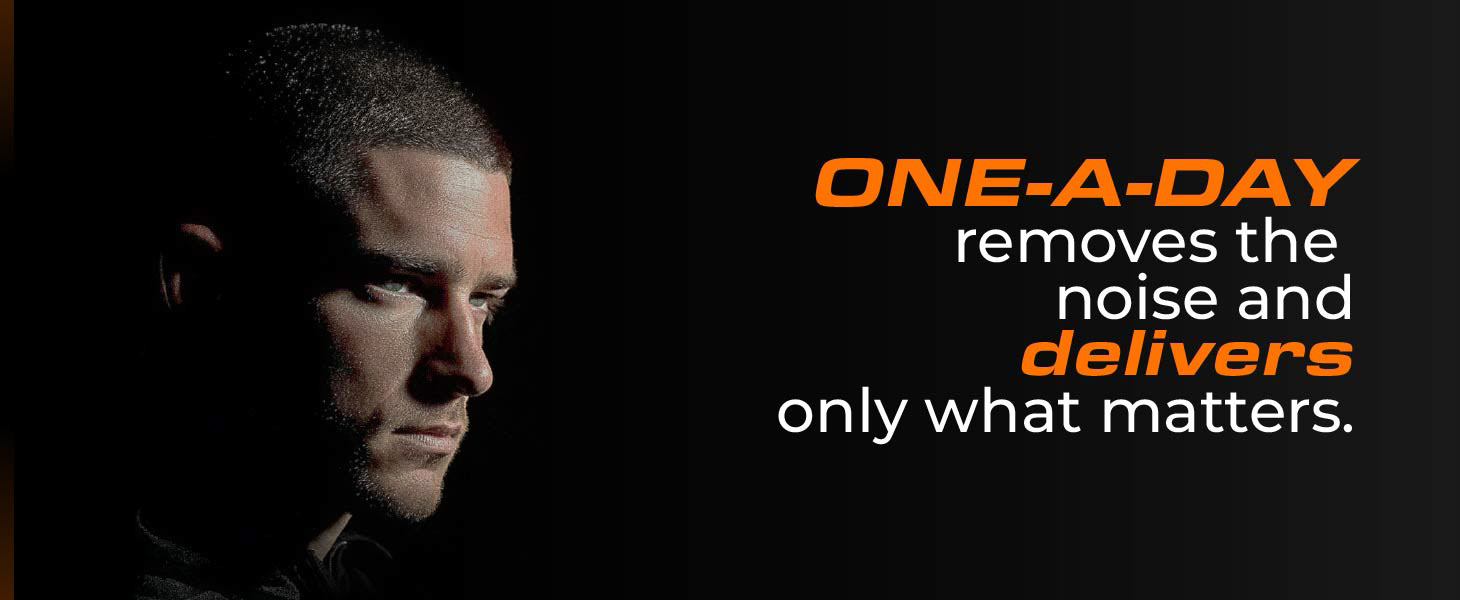
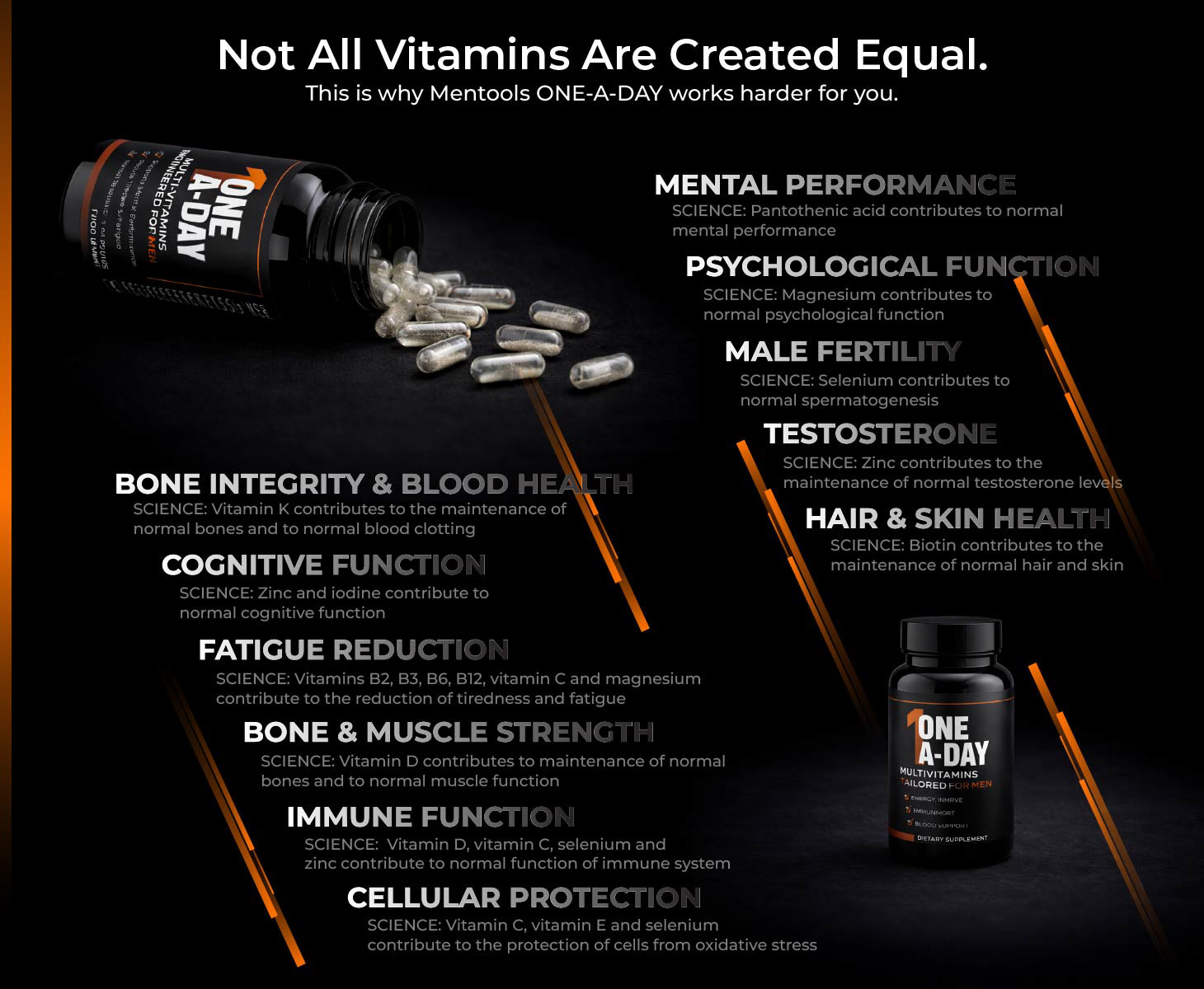
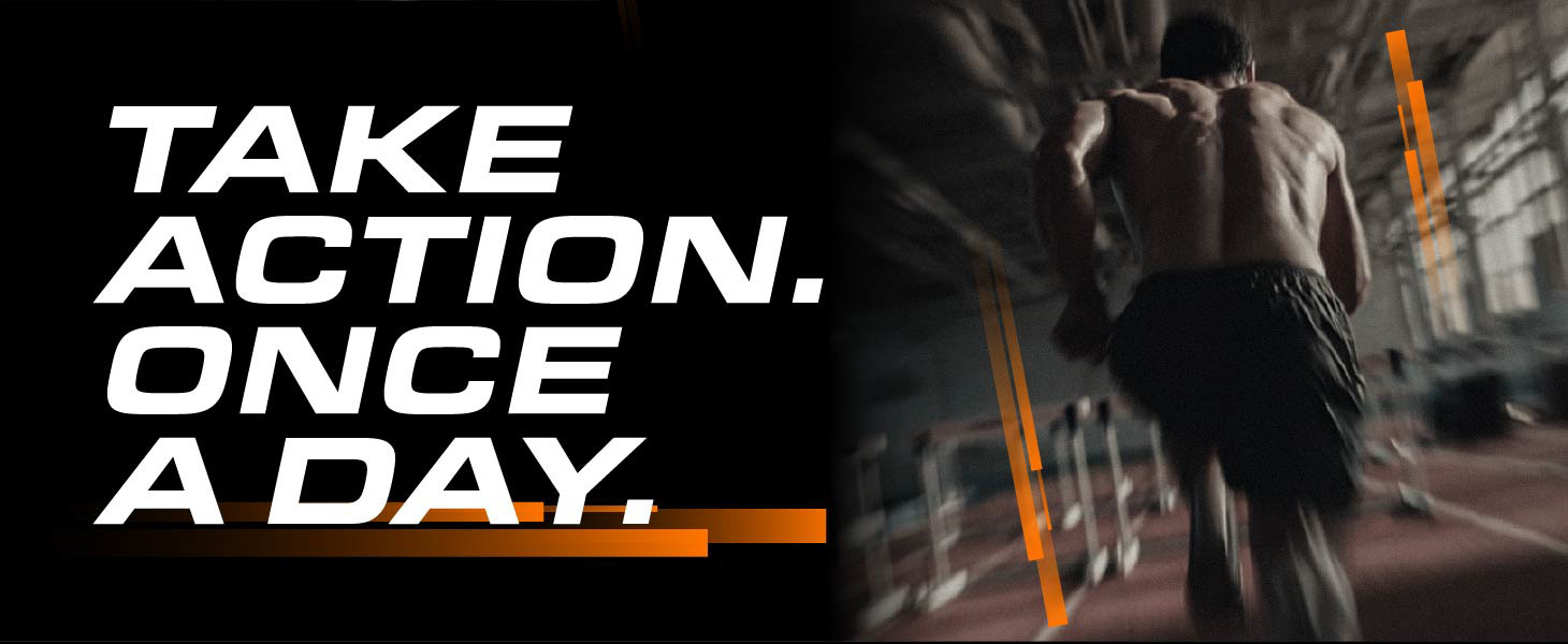
Alongside the listing itself, a suite of static and video assets were produced to support the launch across paid and organic channels, ensuring the product entered the market with a consistent and confident visual identity from day one.


One launch. Every asset.
Built and delivered without an agency required.
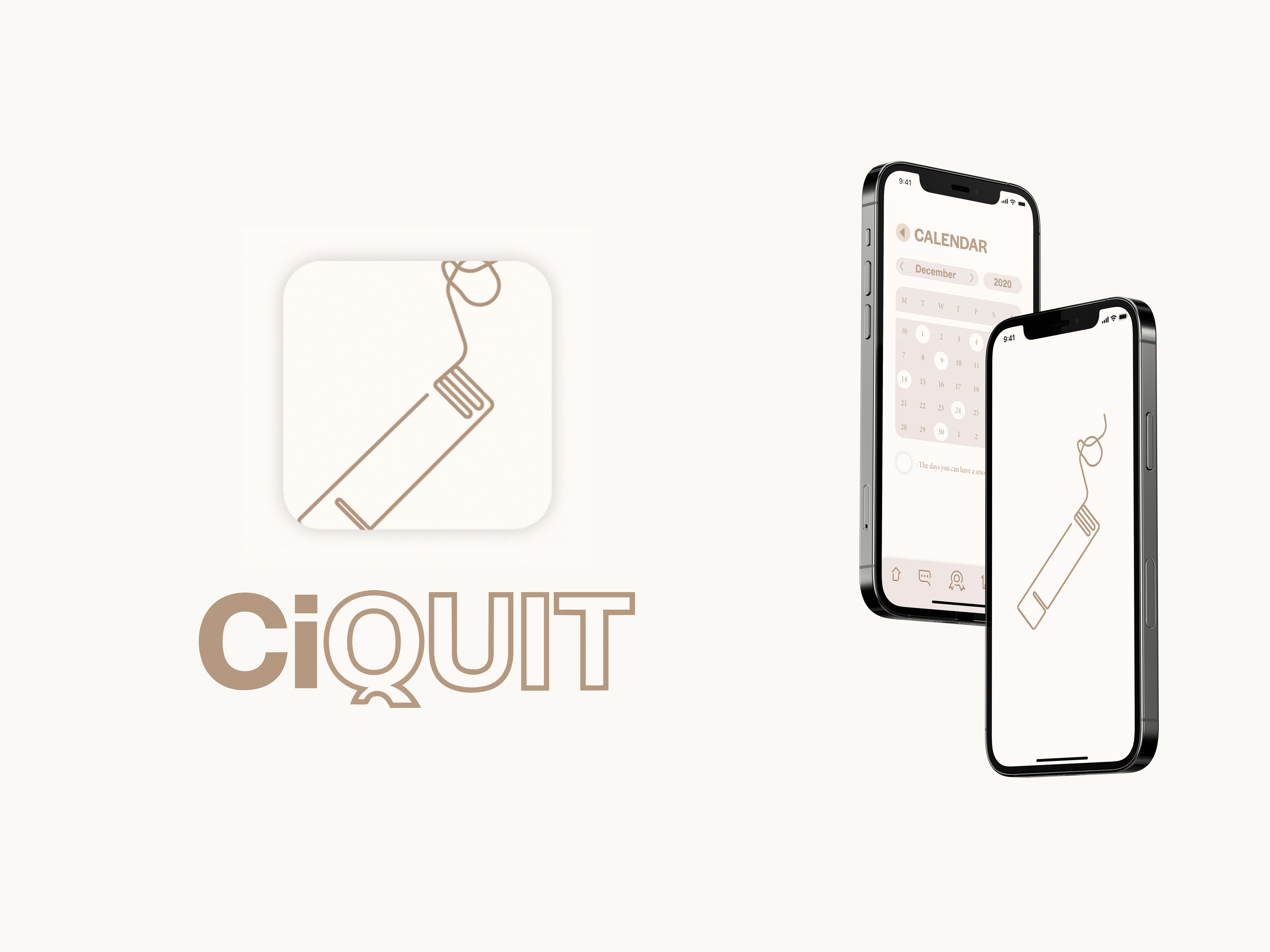
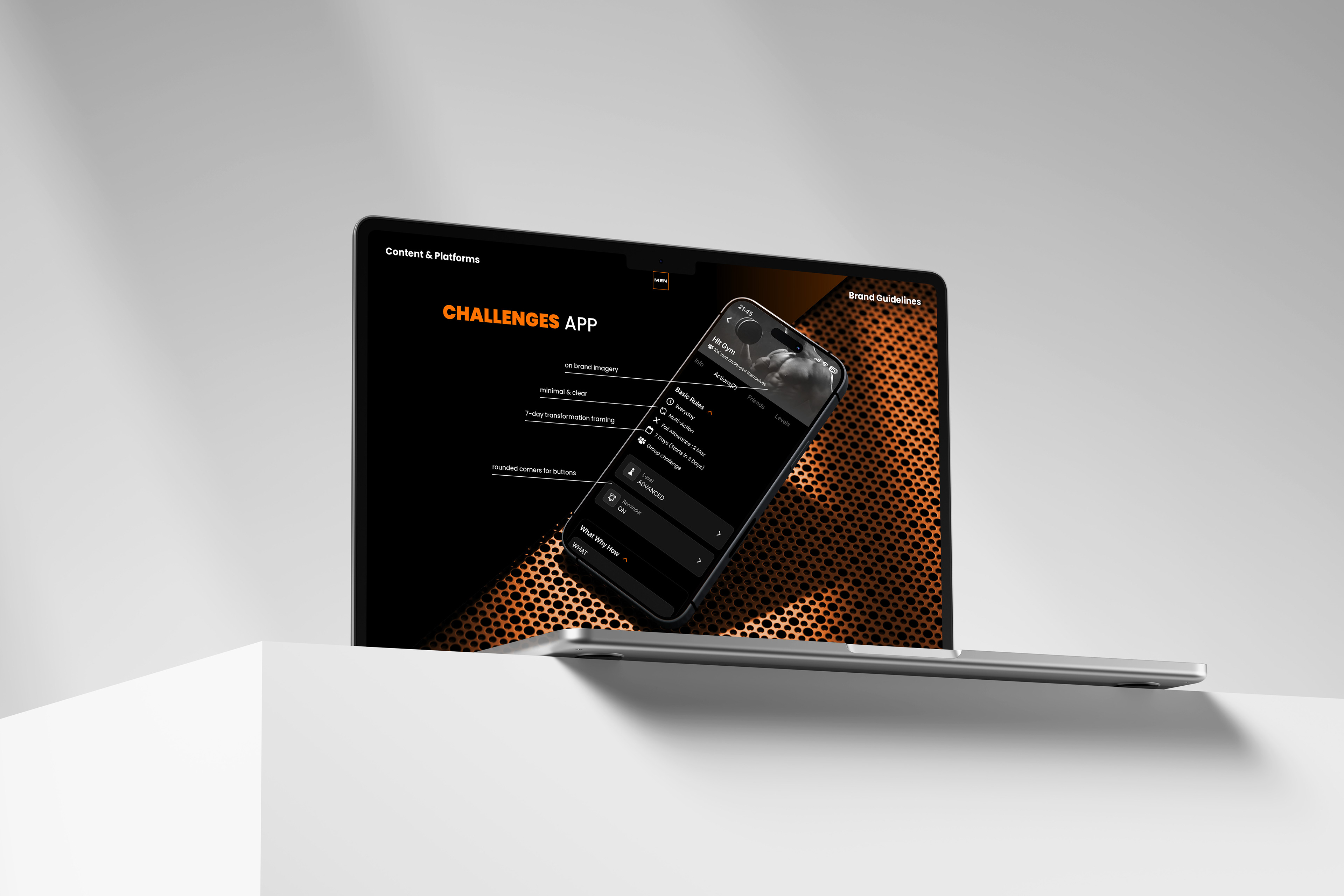
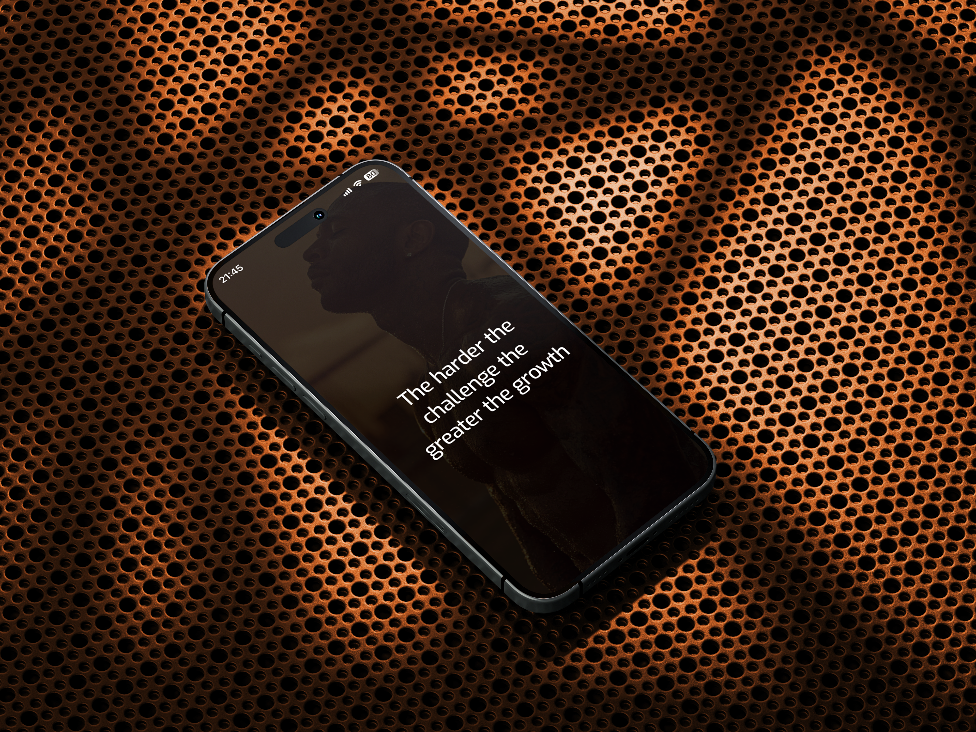
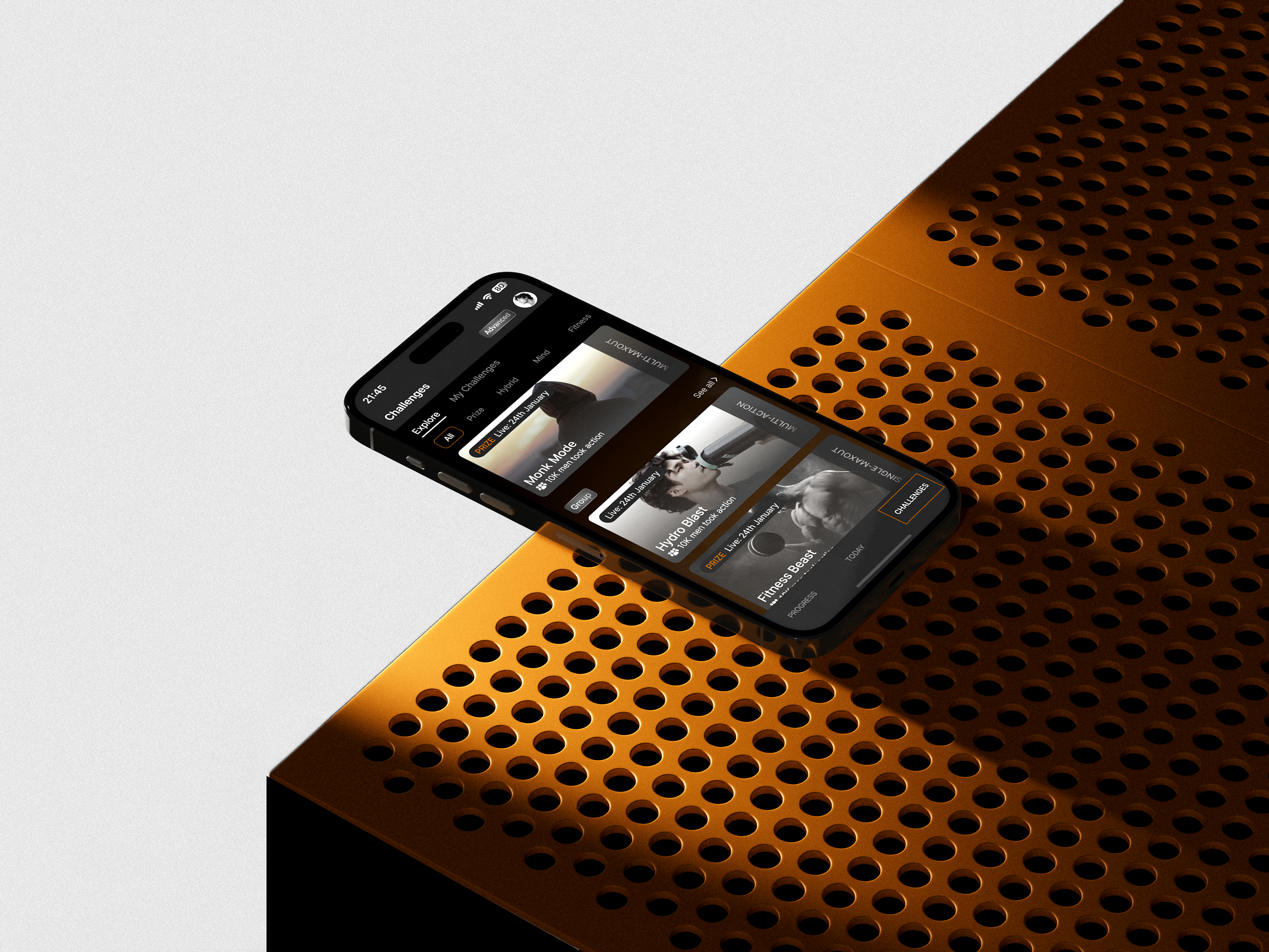
MenTools App
Designing for an app is a fundamentally different discipline to designing for print or social. Every asset has to function within a living, moving product, sitting comfortably within a UI while still carrying enough visual weight to reinforce the brand at every touchpoint a user encounters.
The MenTools app required a comprehensive suite of assets spanning UI visuals, in-app imagery, iconography and some motion content, all produced to a spec that had to work across multiple screen sizes, dark and light contexts, and varying levels of user engagement throughout the product experience.
The challenge wasn't just making things look good. It was making things feel cohesive, ensuring that a user moving through the app experienced a consistent visual world, whether they were onboarding for the first time, tracking their supplements, or engaging with the wellness content built into the platform.
Meditation & Wellness Content
Wellness content lives or dies on atmosphere. A meditation video has to earn a user's stillness, hold their attention without demanding it, and leave them feeling something by the end. That's a design problem as much as it is a production one.
Each video was managed across the full pipeline, concept, visual direction, colour grade, typography and final edit, all produced and delivered in-house without a separate production team.
AI tools were integral to the process here same as anywhere else in the MenTools work. Visual generation tools produced atmospheric and textural imagery that would have been time-prohibitive to create traditionally, while AI voice generation handled the narration, allowing a polished, consistent vocal delivery across every video without the cost or logistics of studio recording.
The creative direction and final edit remained entirely human-led throughout.
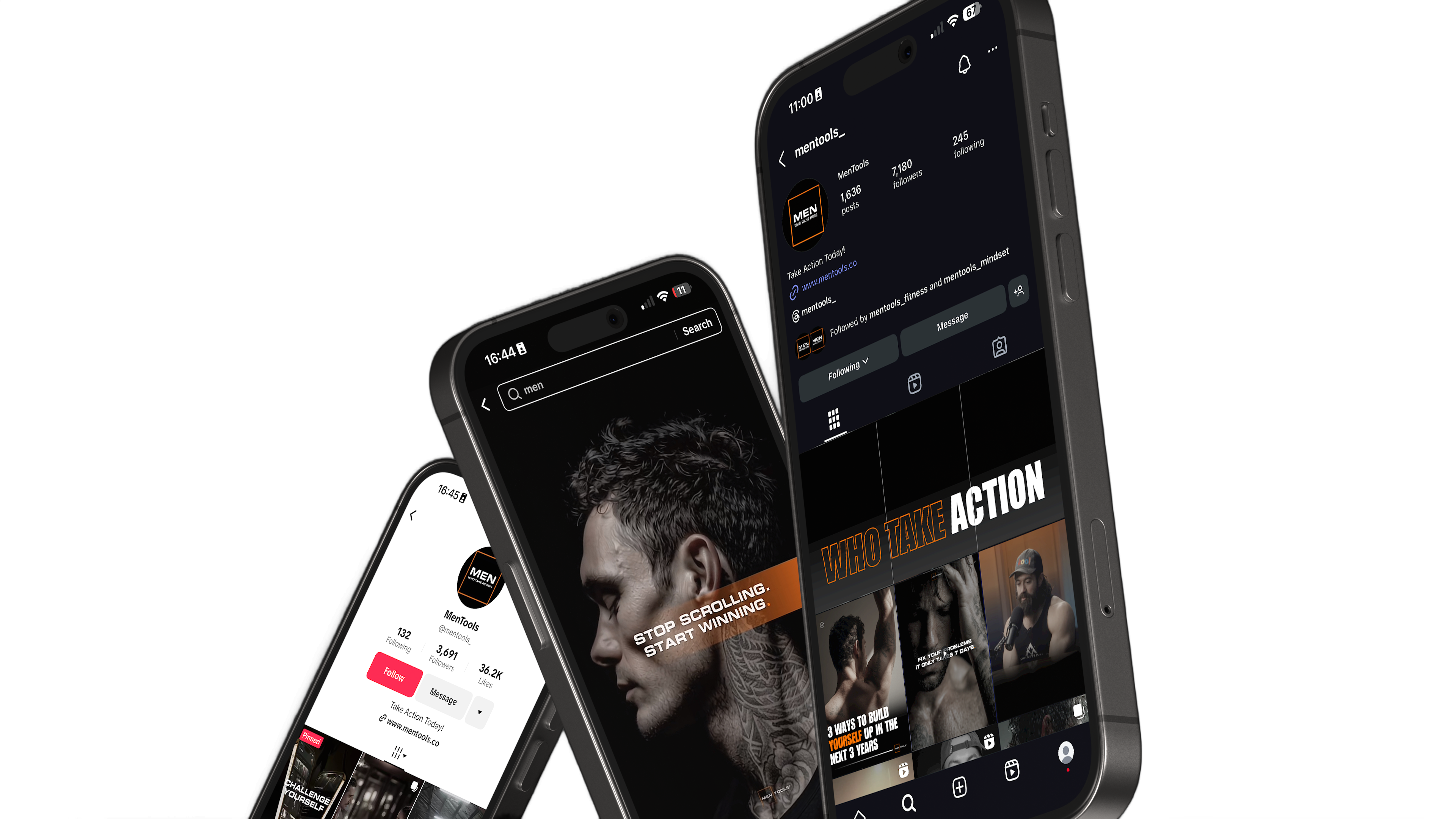
Social Media Content + Ads
Social content at scale is a problem most design tools weren't built to solve alone. Maintaining brand consistency across three platforms with fundamentally different visual languages, audience expectations and format requirements, while producing enough volume to feed an always-on content calendar, demands a system as much as it demands a designer.
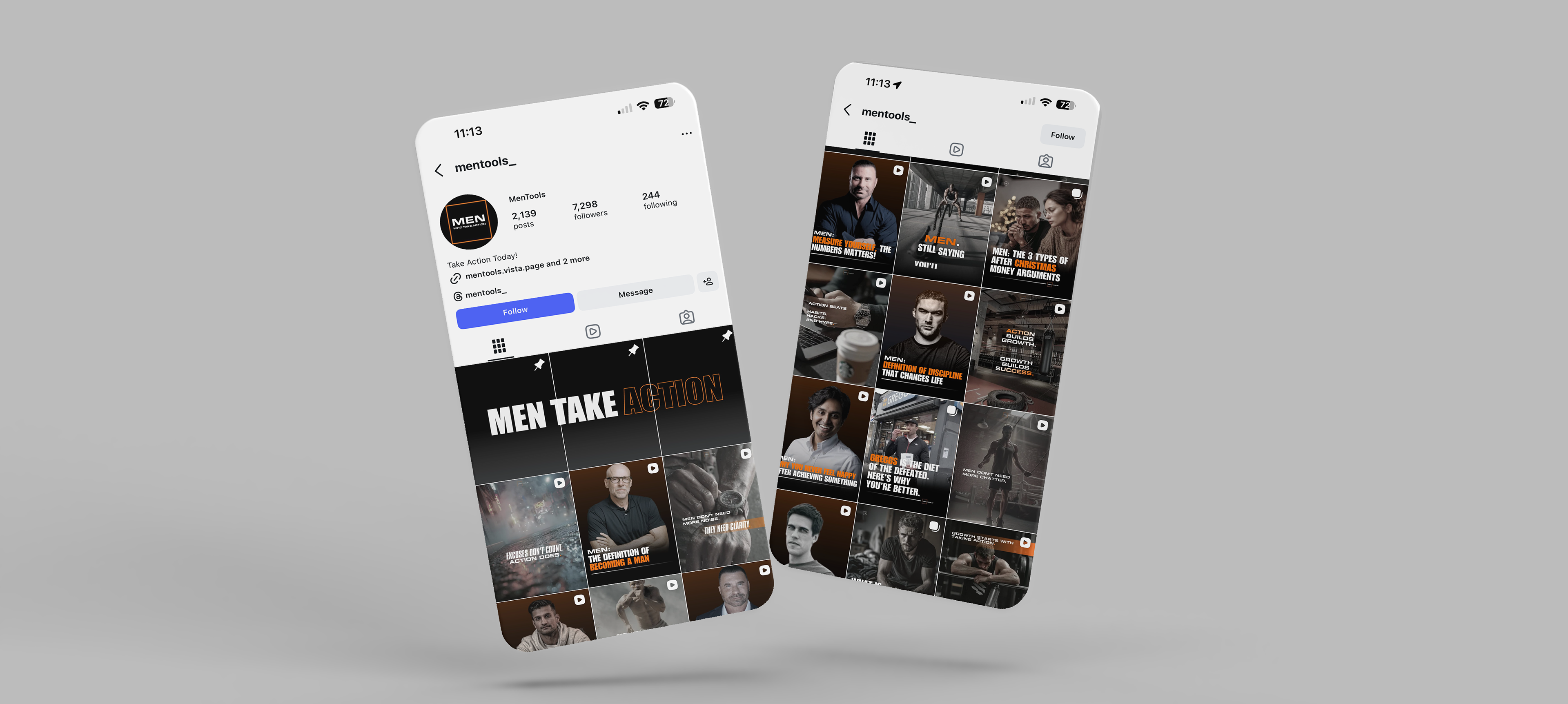
Across Meta, X and TikTok, content was produced spanning static posts, motion graphics and video ads, each platform approached on its own terms while remaining unmistakably MenTools. A Facebook carousel operates differently to a TikTok video, and a static Instagram post has different visual priorities to an X graphic. Understanding those distinctions and designing for them deliberately, rather than simply resizing the same asset, was central to how the content was approached.
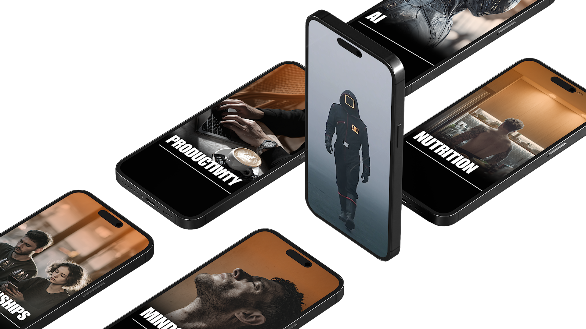
This is also where the AI production system had its most visible impact. By engineering precise prompt structures and workflows, content that would traditionally require a full day of production could be turned around in a fraction of the time, without sacrificing quality or brand consistency. Volume and craft, solved simultaneously.
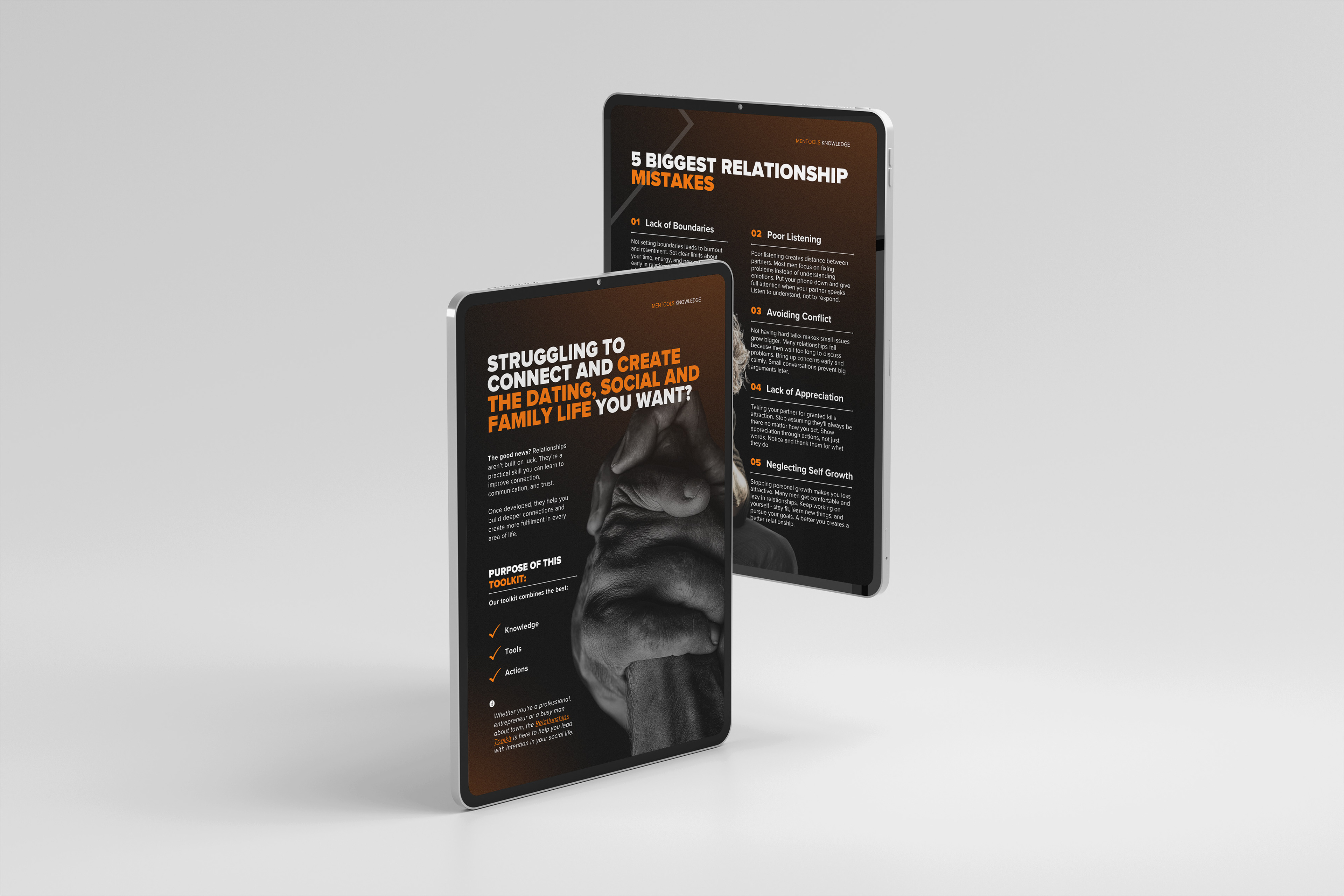
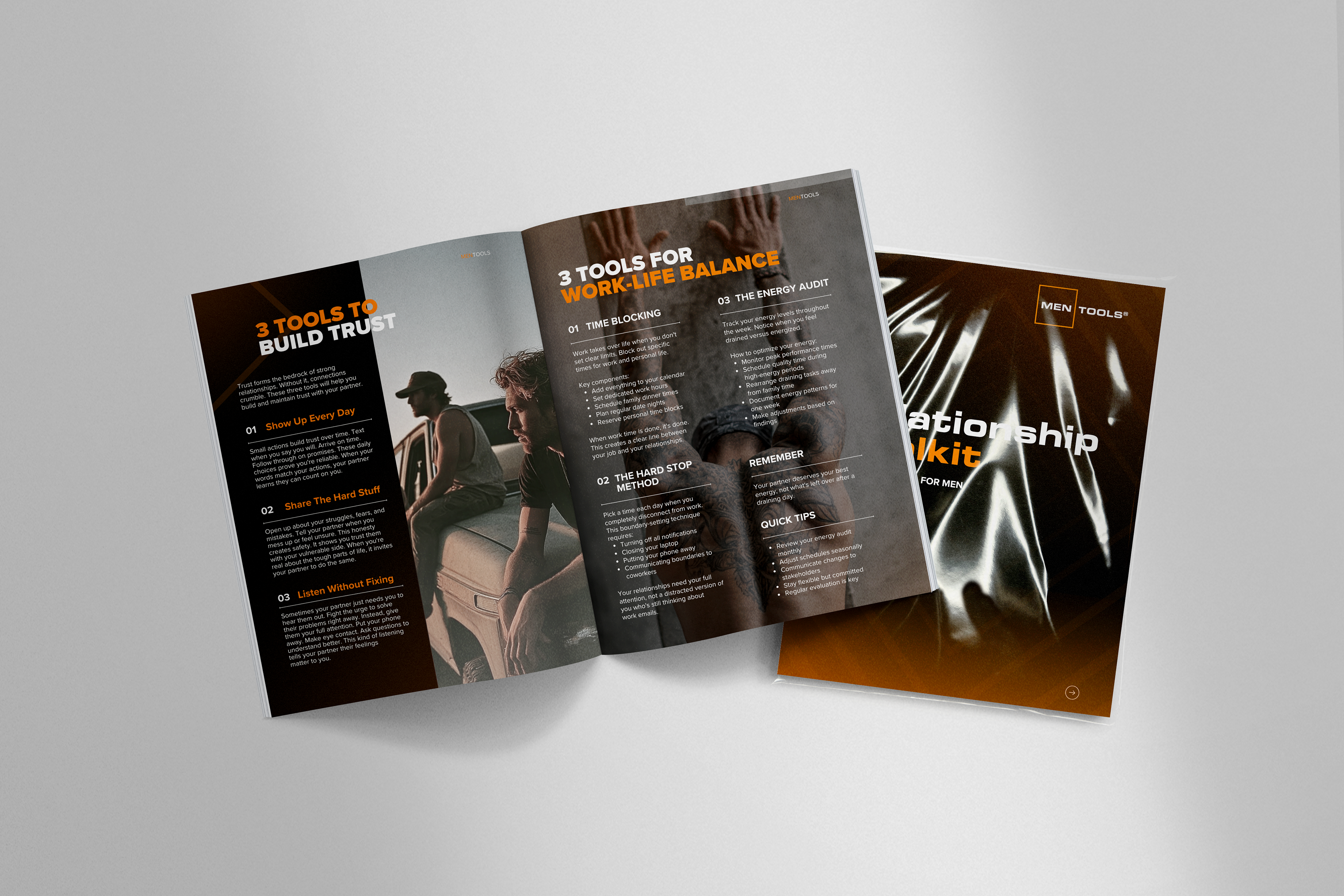
Digital and Printed Toolkit
The toolkit booklets were created to give MenTools users something tangible to refer back to, a structured, designed guide to the brand's products, programme and ethos that lived outside of the app and social ecosystem.
Produced for both print and digital distribution, the design had to work cleanly across both without adaptation, a single layout system that felt considered whether it was read on screen or held in someone's hands.
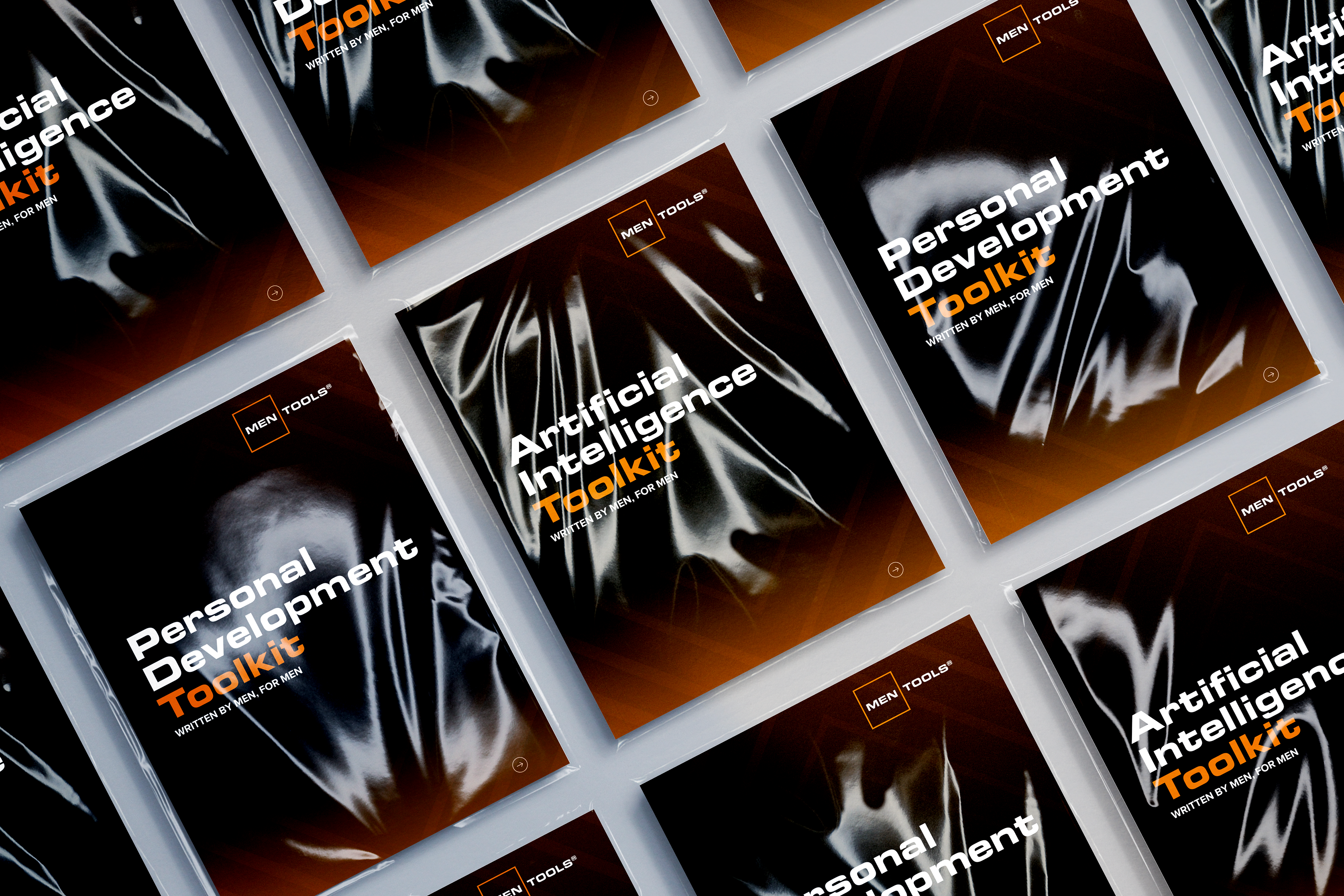
Editorially the challenge was making dense wellness and supplement information feel genuinely readable. Clear hierarchy, considered use of colour and a layout that gave the content room to breathe meant the booklets felt like a natural extension of the MenTools brand rather than a functional document dressed up in brand colours.
AI Automation & Workflow Improvement
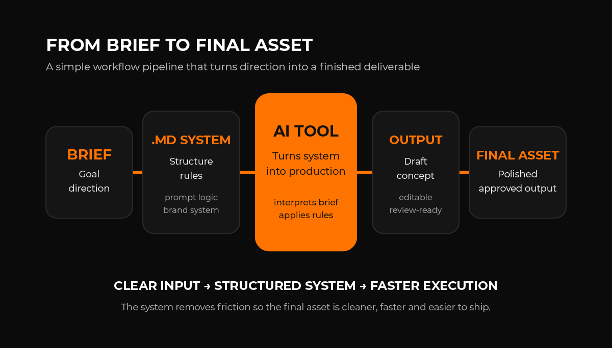
Every designer is using AI now. The difference is how deliberately.
At MenTools, AI wasn't a shortcut bolted onto an existing workflow, it was engineered into the process from the ground up. The foundation was a system of structured .md instruction files, built to give AI tools the exact parameters, brand context, tone and output requirements needed to produce consistent, on-brand results every time. No prompt recycling, no steering mid-conversation, no unpredictable outputs. A brief written once, executed reliably across every subsequent use.
That system touched every part of the creative output in a different way.
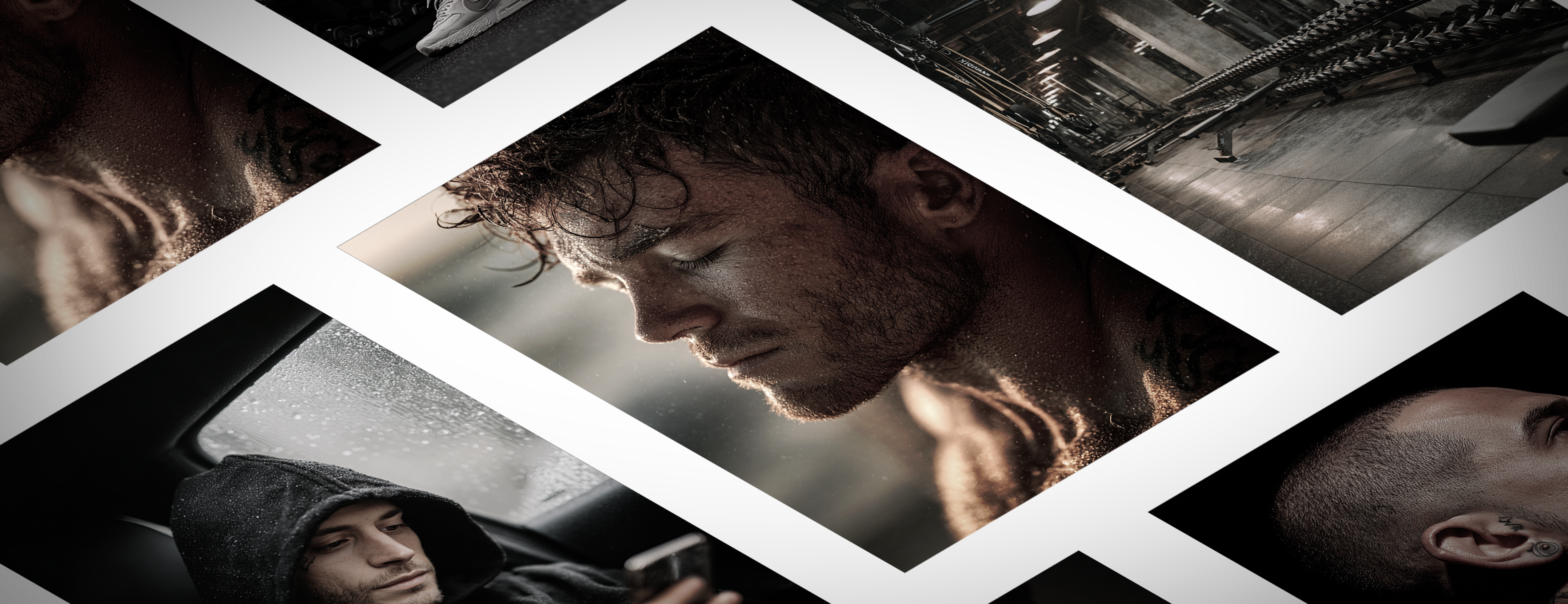
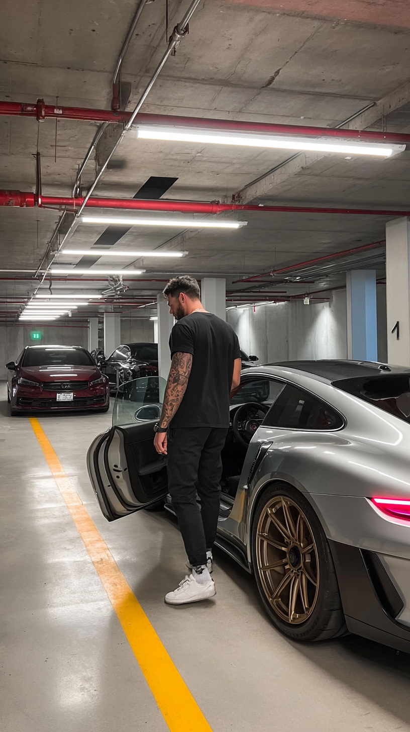
PROMPT: Underground parking garage, raw concrete ceiling with exposed red sprinkler piping, suspended fluorescent strip lights, white columns, gray walls, polished concrete floor with a bold yellow parking line leading forward. A man in an all-black outfit (black tee, black pants) with a metal watch on his left wrist and white low-top sneakers is stepping out of a silver wide-body performance coupe with a black roof; driver door open toward camera, his back to camera, torso slightly turned toward the interior, one foot planted on the yellow line and the other mid-step. The car fills the right half of the frame, rear quarter and large bronze multi-spoke wheel prominent, long rectangular light reflections across the roof and silver bodywork, tinted glass reflecting ceiling lights. Background depth includes a burgundy luxury sedan left and a dark SUV edge right, subdued and realistic. Vertical composition, eye-level, deep depth of field, clean industrial realism, soft top-down shadows.
PROMPT: A high-energy cinematic action photo with a clear hero subject: athletic man deadlift lockout moment in an industrial gym, face tight, shoulders braced. Tight portrait exertion, 85mm. Hard side light + rim highlights. Chalk particles, sweat sheen, detailed shadows, medium DOF. Composition leaves a clean overlay zone: left 35% clean negative space.
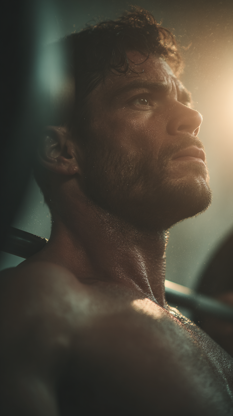
Image generation was used to produce atmospheric and lifestyle imagery, product environments, wellness visuals and campaign backdrops that would have required a full photography production to achieve traditionally. Crucially, the .md system ensured every generated image felt like it belonged to the same visual world rather than a collection of unrelated AI outputs.
SVG infographic generation brought a layer of technical precision to the workflow, using AI to produce structured, scalable vector graphics for use across the app, booklets and digital content. Clean, on-brand, production-ready.
Audio and voice generation handled narration across the meditation and wellness video content, delivering a consistent, polished vocal presence across every video without the cost or logistics of traditional voiceover recording.
Product integration pushed the capability further, placing physical MenTools products into AI generated scenes and lifestyle environments, creating imagery that felt shot and styled rather than generated. The result was a level of visual production that would have required a photographer, a studio and a full production day to replicate traditionally.
AI was also used upstream, long before any asset was produced. Brainstorming sessions, concept development, deep research into competitors, market positioning and audience behaviour, all accelerated through deliberate and structured AI use, compressing days of research into hours without sacrificing depth or accuracy.
The outcome of all of this wasn't just faster production. It was a creative operation that could think, research, concept, produce and deliver at a scale and speed that a single designer simply couldn't sustain through traditional means alone.
AI didn't replace the creative process. It was built into it.