CiQuit was designed around a real person with a real problem. Starting from a close observation of someone struggling with excessive smoking, I used this as the foundation for an in-depth research phase covering UX/UI principles, behavioural patterns and the existing landscape of smoking cessation apps.
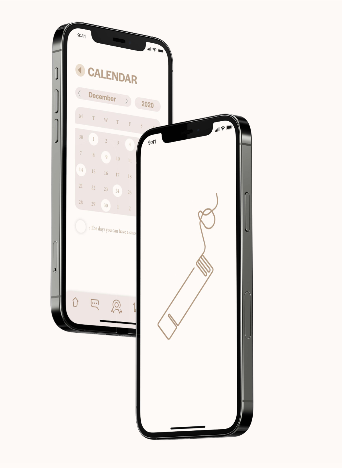
The design challenge was as much about restraint as it was about craft, building an interface that stays completely out of its own way, so the person using it can focus entirely on what matters. The result is a clean, purposeful app experience built around simplicity, ease of use and a single clear goal.
dwawd
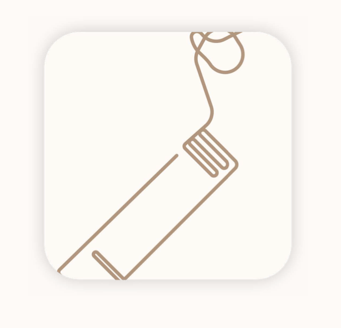
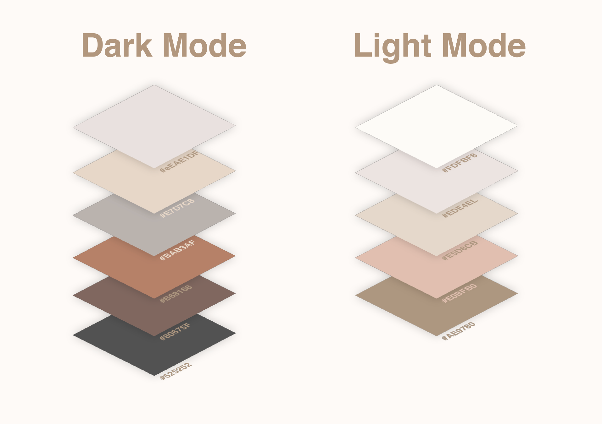
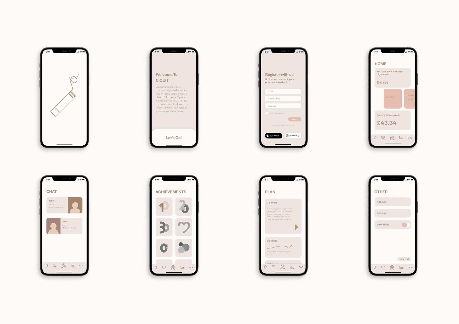
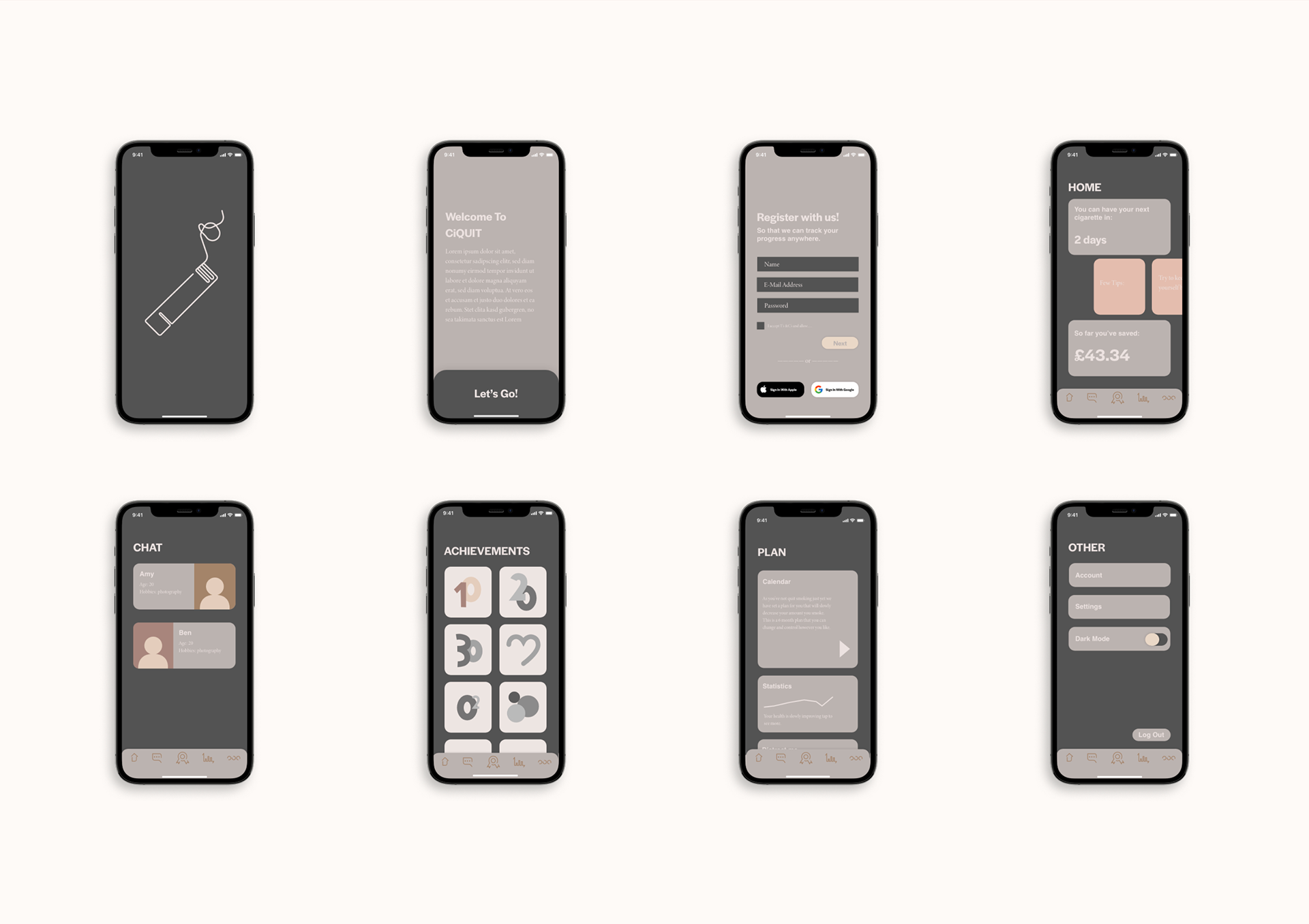
A colour scheme I've chosen to go with is calm nude colours. I think these colours are really relaxing and inviting creating a good experience for the user.
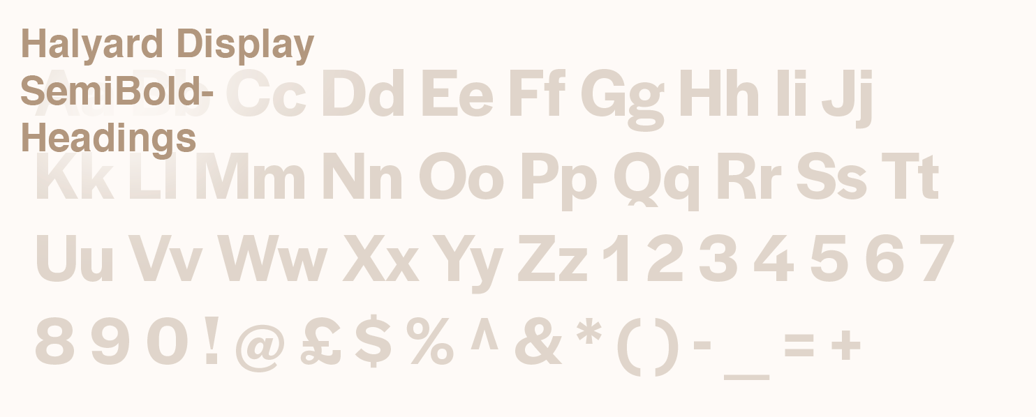
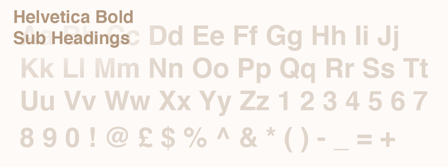
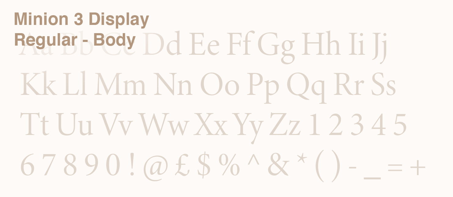
When working with type I like to go with modern and simple typefaces. And I think i achieved that well in this project by having a professional mix of sans and sans serif fonts.
Startup app animation
Light Mode Dark Mode
Interactive Prototypes