

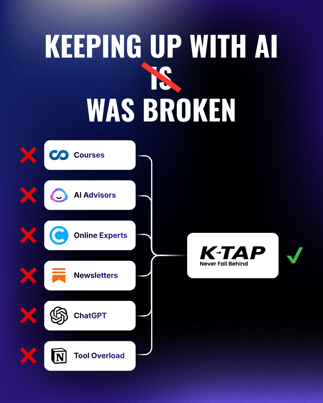
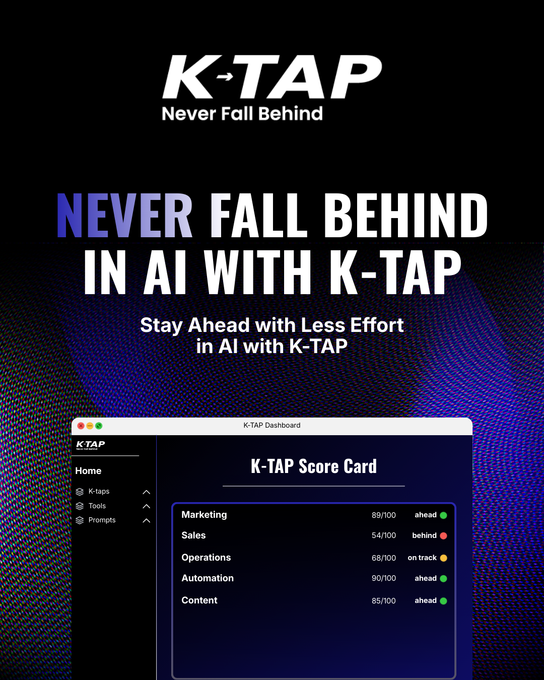
K-Tap is an adaptive AI learning platform built around a single, sharp brand promise; Never fall behind in AI. Designed for founders and business teams, it delivers personalised learning plans powered by three AI experts, tracking competence across critical business domains and adapting to however much time a user can commit.
The design brief was as ambitious as the product itself. K-Tap needed a visual identity that felt as intelligent and forward-thinking as the platform it represented, premium enough to earn founder trust, clean enough to not compete with a technically complex product, and distinctive enough to stand apart in a space crowded with generic SaaS aesthetics.
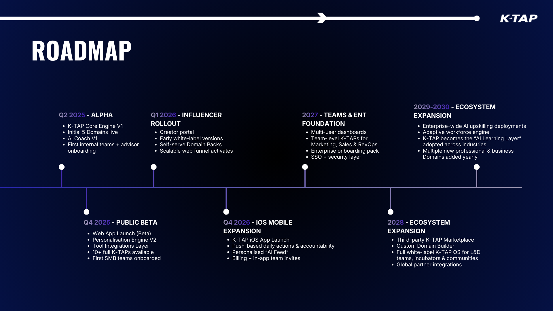
Coming in as the sole designer, working across K-Tap simultaneously alongside MenTools, the task was to build the brand from the ground up. Logo, visual identity, website, pitch presentation and ad creative, all developed from scratch and all required to work together as a coherent, confident visual system from day one.
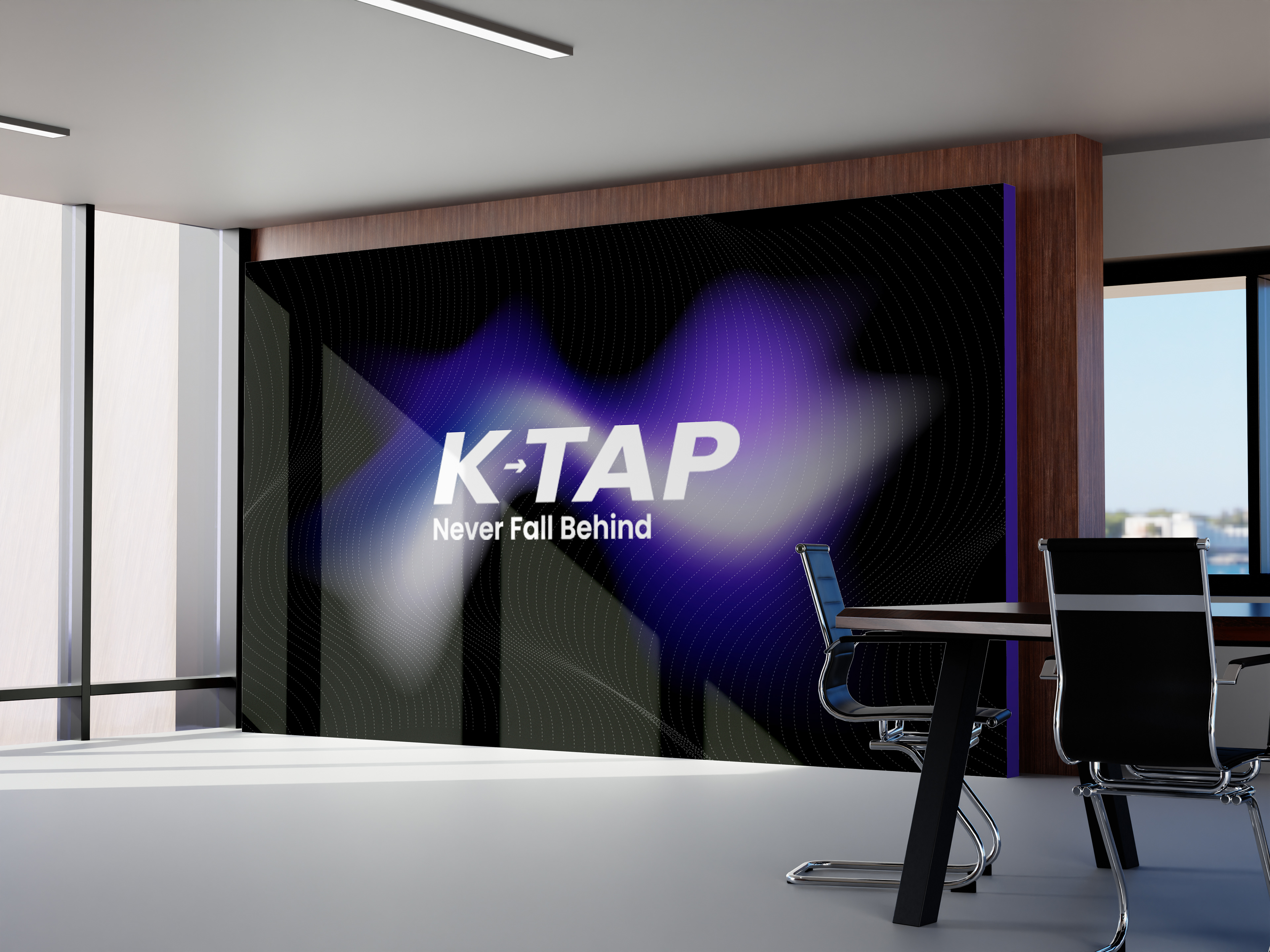

The logo was built around clarity and precision, two qualities that mirror the product itself. Clean geometry, confident typography, and a mark that works at every scale from app icon to billboard without losing its integrity. No decorative complexity, no trend-chasing. A visual identity that communicates authority in a space where authority is everything.
The colour system was equally deliberate. A deep primary blue anchors the brand in trust and professionalism, the colour of a platform founders can rely on. An amber accent cuts through as the action colour, creating urgency without aggression. Status colours, green, yellow, red, were built into the identity system from the start, ensuring the brand language of the platform and the brand language of the marketing always felt like the same world.
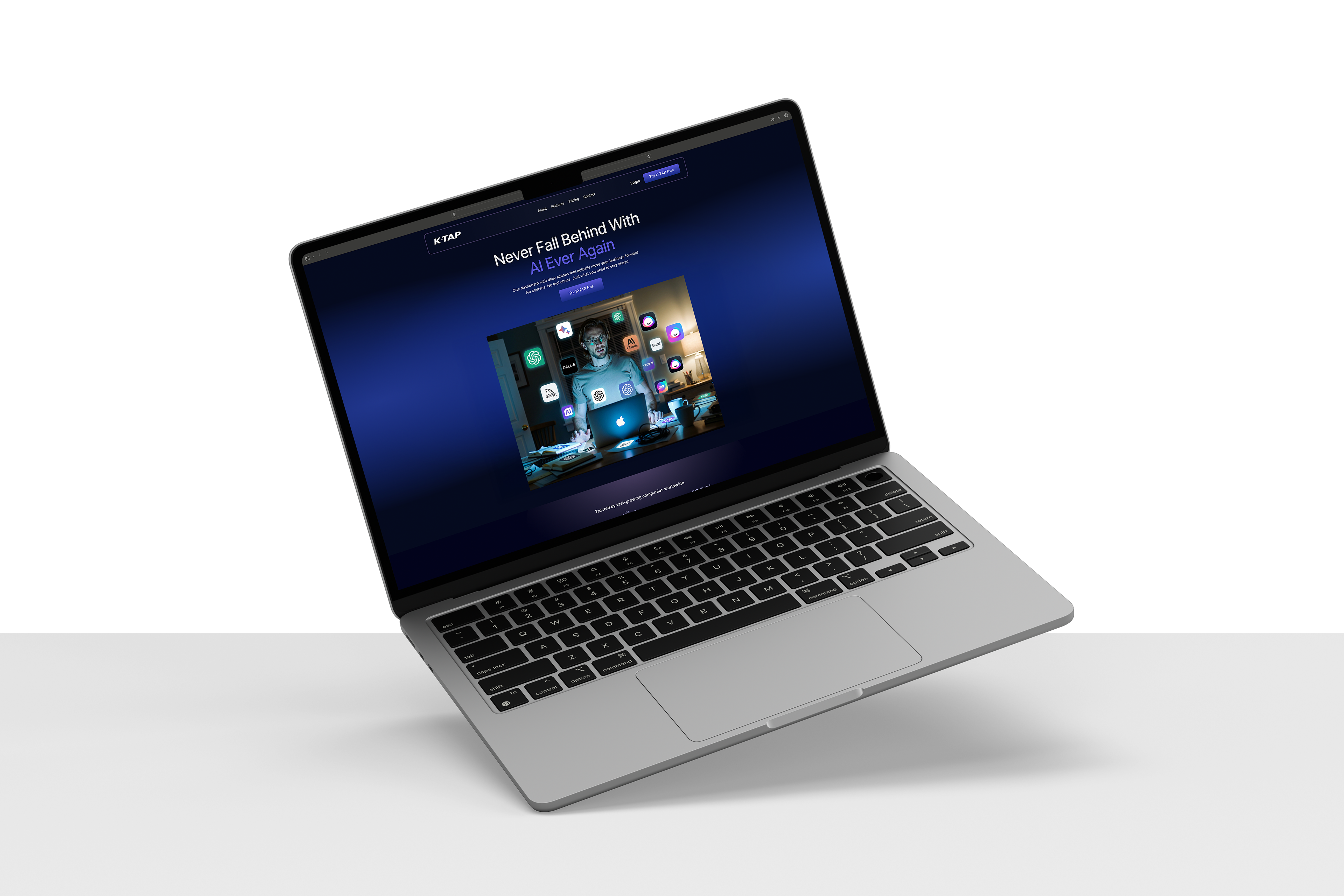
A website for an AI learning platform has a specific and unforgiving job, it has to make a technically complex product feel immediately simple. A founder landing on the K-Tap homepage has roughly ten seconds to understand what it does, why it matters and whether it's for them. The design had to earn all three of those conclusions without asking them to read a paragraph.
The visual language developed for the brand identity was translated directly into the website, deep navy backgrounds, bright CTAs, clean typographic hierarchy and the status colour system running consistently throughout. Every page decision was made with one question in mind: does this make K-Tap feel like the kind of platform a serious founder would trust with their business?
The hero section was built around the brand promise, Never fall behind in AI, with the design doing the work of communicating urgency and clarity simultaneously. Below it, the product's core value propositions unfold in a hierarchy that respects how founders actually read: scanning first, reading second, trusting third.
Across the full site, the challenge was making a multi-layered product, three AI experts, flexible learning plans, domain tracking, team collaboration, competitive scoring, feel like a single, coherent and effortless experience. Complexity hidden. Confidence shown.
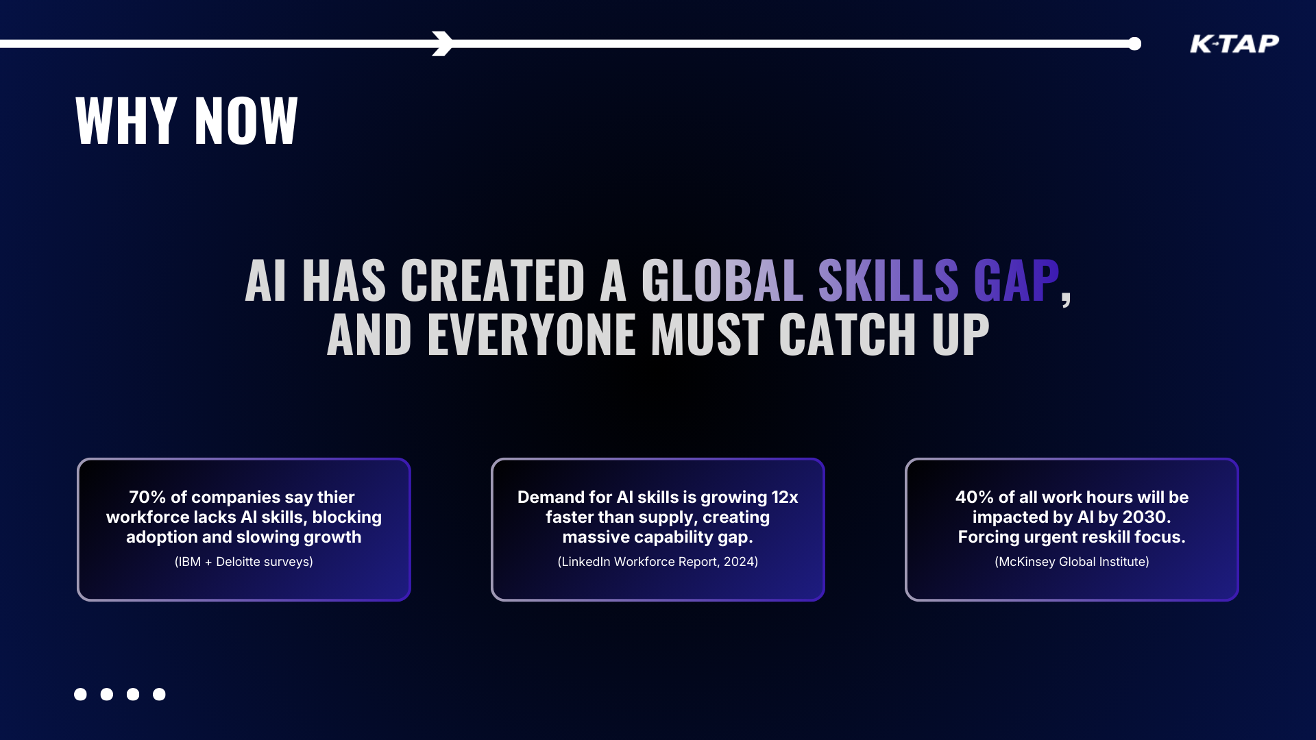
A pitch deck is a different design discipline entirely. Where a website earns trust gradually, guiding a user through a hierarchy of information at their own pace, a pitch deck has to land in a room, hold attention under pressure, and make a compelling case to people whose time and scepticism you have in equal measure.
The K-Tap pitch was built to do exactly that. The narrative follows the product's own three-act structure, the founder's problem, why existing solutions fail, and why K-Tap is the only answer built for how founders actually work. Every slide had one job. The moment a slide tried to do two things, it was redesigned until it did one thing better.
Visually the deck stays firmly within the K-Tap brand system, deep navy, clean typographic hierarchy, but adapted for presentation context. Slides that work on a laptop screen in a quiet room need to work equally well projected in a boardroom or shared as a PDF over email. Designing for all three contexts simultaneously without the deck feeling compromised in any of them was a core constraint from the start.
Data, competitor positioning, market sizing and product architecture all needed to feel authoritative without feeling dense. The solution was restraint, one key stat per slide, one clear takeaway, one visual that does the explaining so the presenter doesn't have to. A deck that gets out of its own way and lets the product make the case.
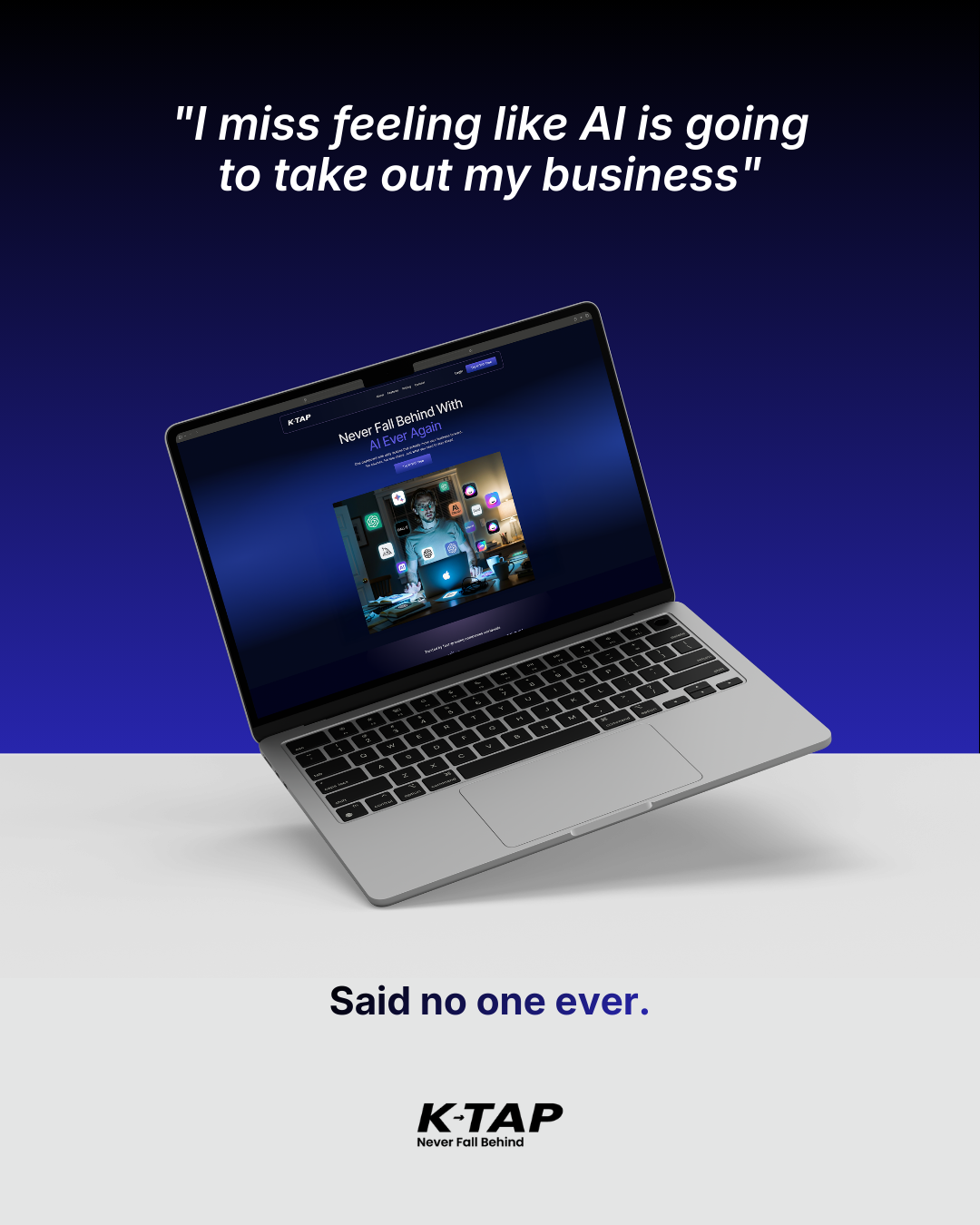
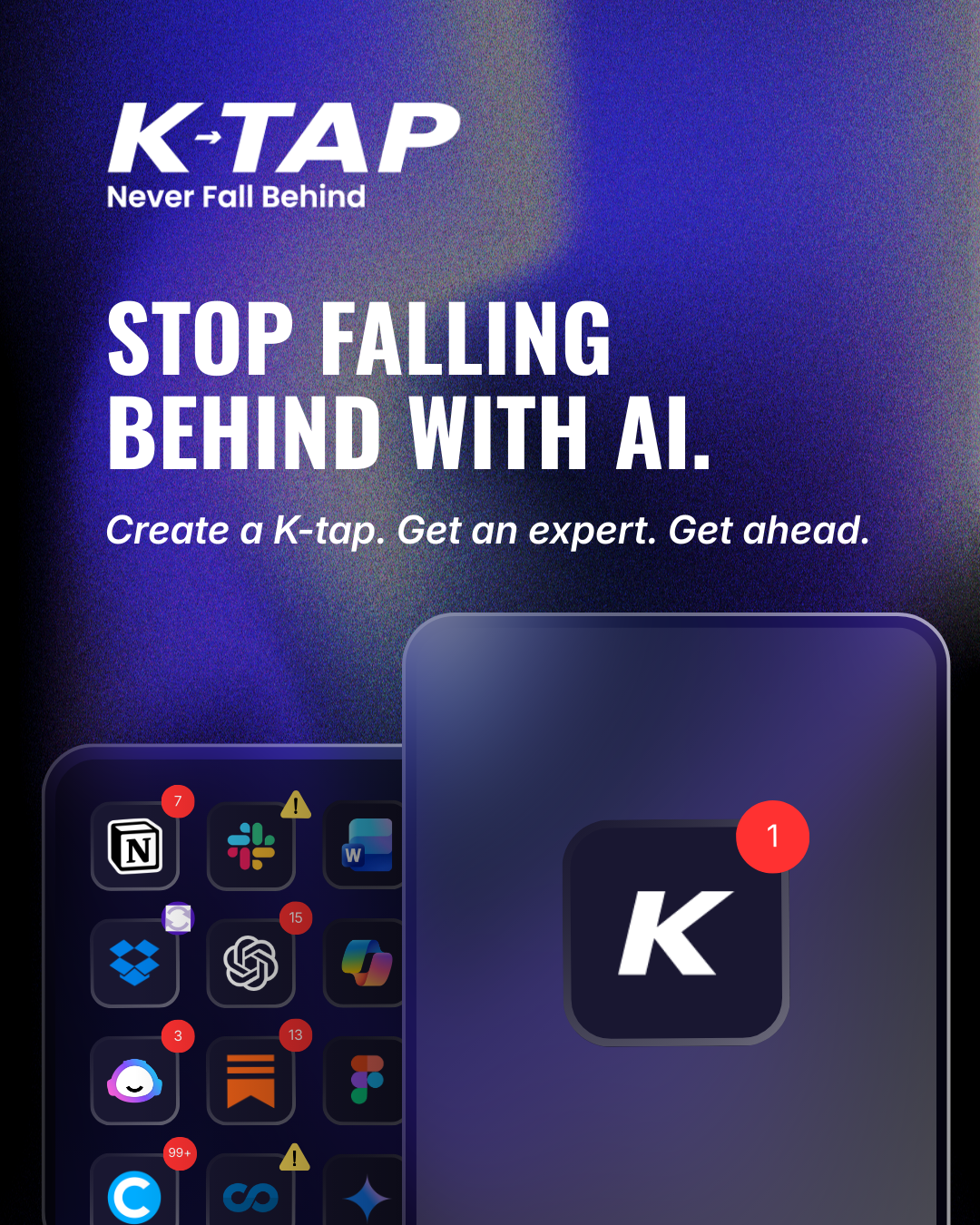
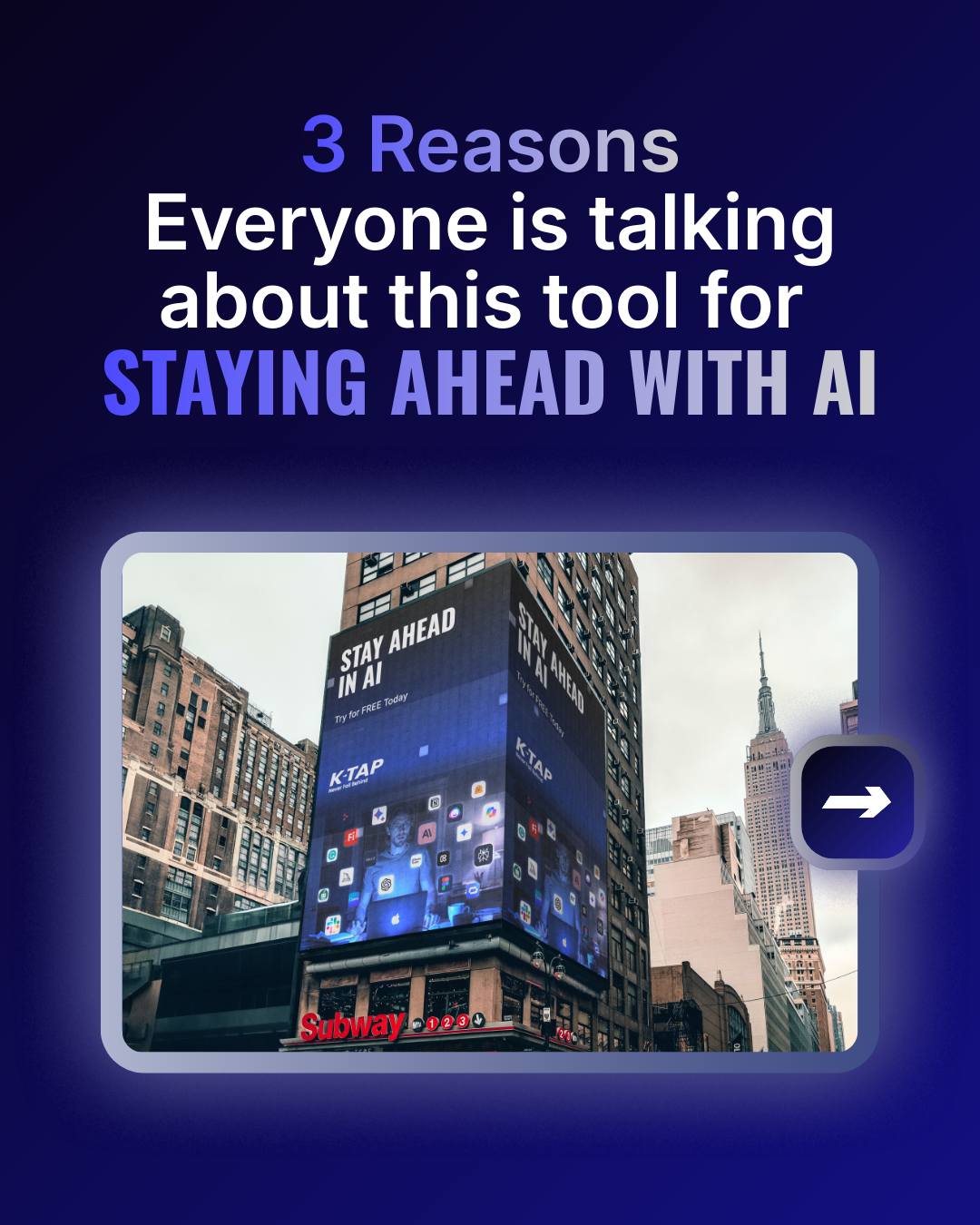
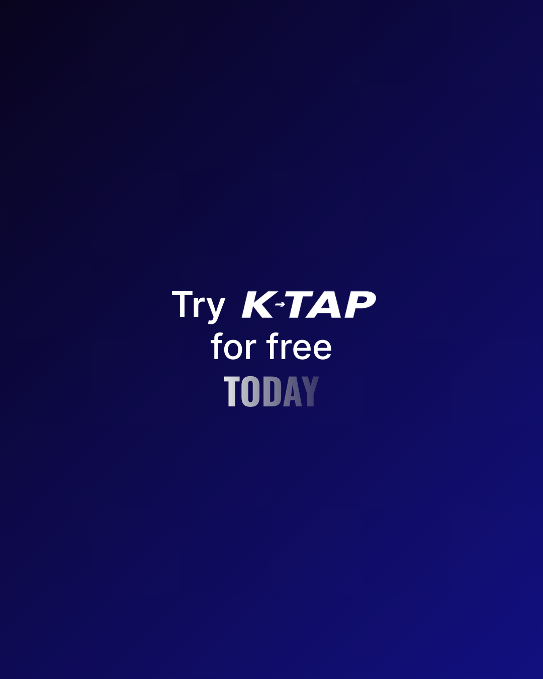
Ad creative for an AI platform lives at the sharpest end of the brand. Where the website has space to build a case and the pitch deck has a presenter to carry the room, an ad has a fraction of a second to stop a scroll, communicate a feeling and make someone want to know more. There is no room for ambiguity and no second chance.
The K-Tap ad creative was built around the brand promise as a single, uncompromising visual idea, Never fall behind in AI. Every execution, across every format, came back to that line. Not as a tagline dropped into a corner, but as the organising principle that every visual decision served. The urgency had to be felt before a word was read.

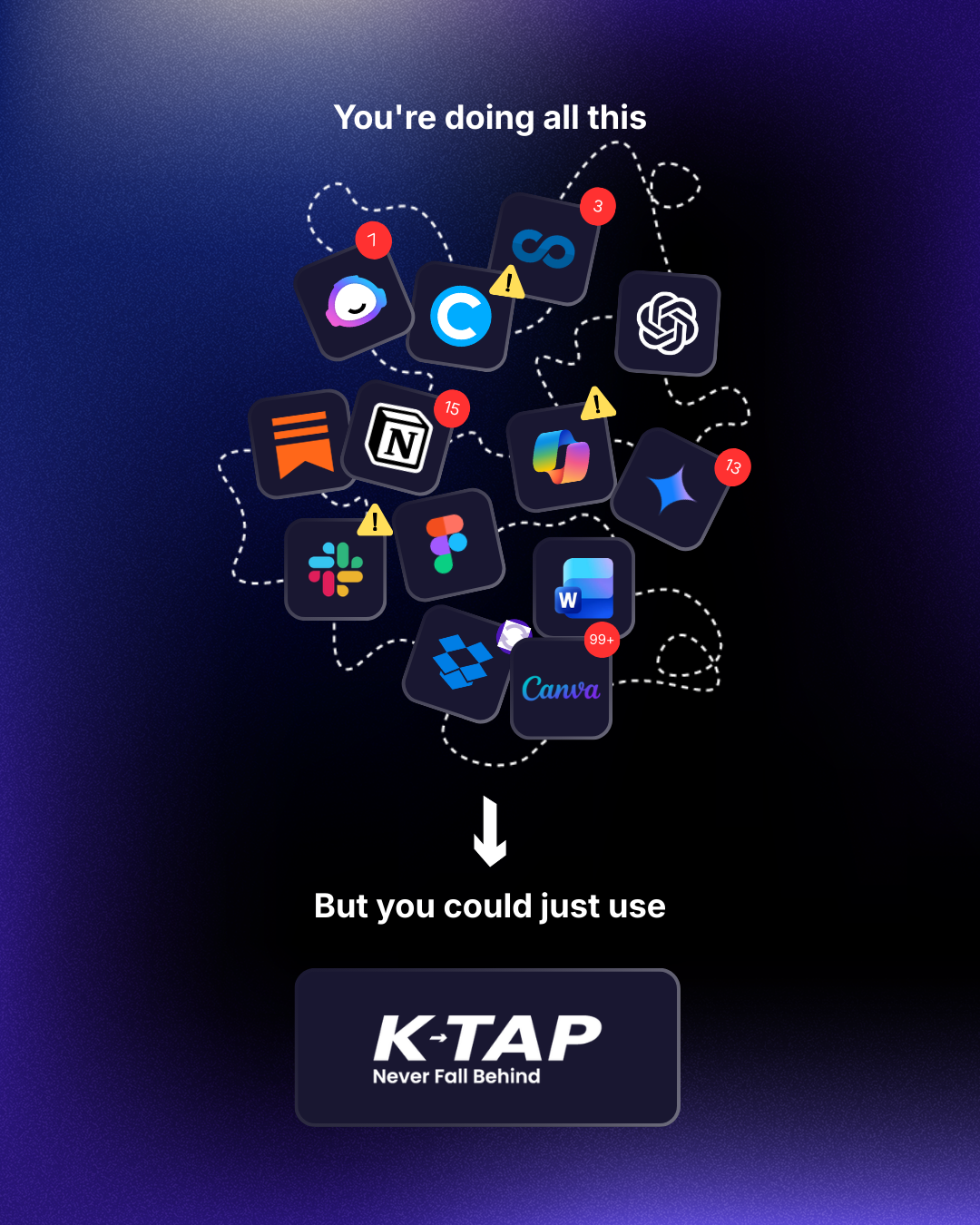
Across static formats the challenge was hierarchy, leading with the emotional hook, supporting it with just enough product context to create curiosity, and closing with a CTA that felt inevitable rather than forced. The action button does significant work here, drawing the eye through the composition in a deliberate sequence that mirrors how the product itself guides a user through their learning journey.
The brand's dark, premium aesthetic was particularly powerful in ad contexts, in a feed dominated by bright, noisy creative, a composed and confident dark-mode execution stops the scroll precisely because it doesn't look like everything else around it. Distinctiveness as a strategy, not just a style choice.
In a feed full of noise, the quietest confidence wins.